解决Antd Table表头加Icon和气泡提示的坑
对于Antd Table组件的columns数组来说,它需要接受2个属性(filterDropdown,filterIcon)才能在表头某个属性旁展示图标Icon:
columns: [{
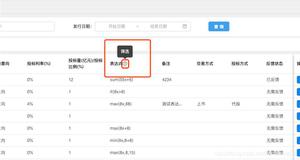
title: '表达式', dataIndex: 'formulaTenderAmount', key: 'formulaTenderAmount', width: 150, placeholder: '请输入表达式',
filterDropdown: (<div></div>),
filterIcon: <Tooltip placement="top" title="气泡悬浮提示文本" >
<Icon type='question-circle-o' style={{ marginLeft: 1 }} />
</Tooltip>,
},{
title: '操作',
dataIndex: 'operation',
key: 'operation',
width: 305,
fixed: 'right',
},
],
然后,结果是怎样呢?
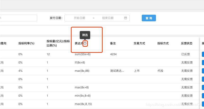
结果是气泡提示框的文本并不是我们期望的 “气泡悬浮提示文本” ,而是 “筛选” 两个字
为什么?
看这里~react ant design 中如何在表头中加个Icon和排序,悬浮icon又触发Tooltip
需求:
本篇文章适用于表头同时添加悬浮和排序,另,只需支持文字悬浮对title封一层方法即可eg:
const TooltipTitle = (text, title) => { // text 展示的thead title 展示的提醒文字
return (
<Fragment>
<span style={{ marginRight: 8 }}>{text}</span>
<Tooltip placement="top" title={title}>
<Icon type="question-circle" theme="outlined" />
</Tooltip>
</Fragment>
);
};
ant design中的table中的thead支持信息提示和远程加载排序。

困难点
ant design 没有提供两者同时存在的api;直接添加sorter,同时对我们的title封装方法,出现点击排序,只会触发单一的一个排序,这不是我们最终达成的结果。那么在不对title做处理的情况下,实现信息提示和排序的方法
解决
const columns = [{
title: '姓名',
dataIndex: 'name',
key: 'name',
sorter: true, // 实现排序Icon出现,开始交互排序
filterDropdown: true, // 自定义的列筛选功能,我们占位为信息提示Icon的位置
filterIcon: () => {
return (
<Tooltip placement="top" onVisibleChange={() => onVisibleChange(1)}>
// 在这不写title的原因是ant design 内部有很多title,内部结构并没有对特殊的情况做处理,只接收一个title,
// 并覆盖不了默认是筛选。
<Icon type="question-circle" theme="outlined" />
</Tooltip>
);
},
}, {
title: '年龄',
dataIndex: 'age',
key: 'age',
}, {
title: '住址',
dataIndex: 'address',
key: 'address',
}];
onVisibleChange = (key) => { //Tooltip 显示隐藏的回调,类似onmouseenter 进入离开事件,用来显示我们不同的信息提醒
let str = '';
switch (key) {
case 1:
str = '你的姓名';
default:
break;
}
this.setState({
filterTitleKey: str,
});
}
handleTableChange = (pagination, filters, sorter) => {
console.log(pagination, filters, sorter);
}
<Table
dataSource={dataSource}
columns={columns}
onChange={() => this.handleTableChange}
locale={{
filterTitle: filterTitleKey || '默认', // 设一个默认是防止控制台的报错,移除以后造成filterTitle为空,失败;
}}
/>
样式需要自己去调整
简易解释
ant design table 中 filterIcon api 相关的源码解析 ,一些我们未能解决的问题,我们可以通过研究源代码去分析或可供我们
使用的api方法。
renderFilterIcon = () => {
const { column, locale, prefixCls, selectedKeys } = this.props;
const filtered = selectedKeys && selectedKeys.length > 0;
let filterIcon = column.filterIcon as any;
if (typeof filterIcon === 'function') {
filterIcon = filterIcon(filtered);
}
const dropdownIconClass = classNames({
[`${prefixCls}-selected`]: filtered,
[`${prefixCls}-open`]: this.getDropdownVisible(),
});
return filterIcon ? ( // 重点在这,官网提供了filterIcon api,并未提供filterTitle,来解决我们现实遇到的问题
React.cloneElement(filterIcon as any, {
title: locale.filterTitle, // 因源码内部有个title,我们实现让它动态展示,层叠掉默认的title
className: classNames(`${prefixCls}-icon`, dropdownIconClass, filterIcon.props.className),
onClick: stopPropagation,
})
) : (
<Icon
title={locale.filterTitle} // 同理上,供我们使用的api
type="filter"
theme="filled"
className={dropdownIconClass}
onClick={stopPropagation}
/>
);
};
有兴趣的同学可以看一看完整的代码,看看实现的具体过程,小编不才,只展示部分实现的过程,详细的原理小编未给出,敬请谅解...
好了~ 回归正题吧!
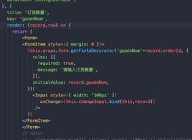
如此,我改成了以下的代码,并且新增了onVisibleChange方法,新增了state的属性filterTitleKey,并且在Table组件属性中增加了locale对象:
this.state = {
filterTitleKey: '',
}
columns: [{
title: '表达式', dataIndex: 'formulaTenderAmount', key: 'formulaTenderAmount', width: 150, placeholder: '请输入表达式',
filterDropdown: (<div></div>),
filterIcon: <Tooltip onVisibleChange={() => this.onVisibleChange(1)} placement="top" >
<Icon type='question-circle-o' style={{ marginLeft: 1 }} />
</Tooltip>,
},{
title: '操作',
dataIndex: 'operation',
key: 'operation',
width: 305,
fixed: 'right',
},
],
onVisibleChange = (key) => { //Tooltip 显示隐藏的回调,类似onmouseenter 进入离开事件,用来显示我们不同的信息提醒
let str = '';
switch (key) {
case 1:
str = '函数计算,x表示发行规模';
default:
break;
}
this.setState({
filterTitleKey: str,
});
}
这边会有Table的一个属性locate,官网是这样解释的:

<Table
loading={loading}
className='editableTable'
size="small"
style={{ height: tableHeight - 40 }}
columns={columns}
locale={{
filterTitle: filterTitleKey || '默认', // 设一个默认是防止控制台的报错,移除以后造成filterTitle为空,失败;
}}
dataSource={dataSource}
pagination={pagination}
scroll={{ x: 2400, y: tableScrollHeight }}
/>
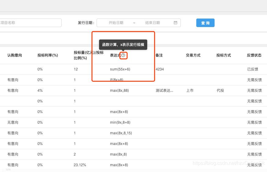
这样就能正常的显示气泡文本了:
以上这篇解决Antd Table表头加Icon和气泡提示的坑就是小编分享给大家的全部内容了,希望能给大家一个参考,也希望大家多多支持。
以上是 解决Antd Table表头加Icon和气泡提示的坑 的全部内容, 来源链接: utcz.com/p/218790.html