vue 公共列表选择组件,引用Vant-UI的样式方式
此组件用于公共选择组件。引用Vant UI 作为样式
特性:
1、支持动态、静态数据源。
2、支持分页加载。
3、支持模糊搜索。
4、支持单选、多选。
组件源码:
<template>
<div class="gn-PubSelect">
<van-action-sheet v-model="inShow">
<div class="gn-PubSelect-main" :style="{'height':mainHeight}">
<van-search class="gn-search" placeholder="请输入搜索关键词" v-model="condition" show-action>
<van-button slot="action" size="small" type="primary" @click="inShow = false">确认</van-button>
</van-search>
<div class="gn-select-list">
<van-list
v-model="loading"
:finished="finished"
finished-text="没有更多了"
@load="filterSelectList"
>
<!--单选控件-->
<van-radio-group v-model="radioResult" v-if="type == 'radio'">
<van-cell-group>
<van-cell
class="gn-cell"
v-for="(item, index) in filterList"
:title="item.Name"
@click="radioResult = item"
:key="item.Id"
clickable>
<van-radio
checked-color="#07c160"
slot="right-icon"
:name="item" />
{{item.Number}}
</van-cell>
</van-cell-group>
</van-radio-group>
<!--复选控件-->
<van-checkbox-group v-model="checkboxResult" v-if="type == 'checkbox'">
<van-cell-group>
<van-cell
class="gn-cell"
v-for="(item, index) in filterList"
clickable
:key="item.Id"
:title="`${item.Name}`"
@click="toggle(index)"
>
<van-checkbox
ref="checkboxes"
checked-color="#07c160"
slot="right-icon"
:name="item"
/>
{{item.Number}}
</van-cell>
</van-cell-group>
</van-checkbox-group>
</van-list>
</div>
</div>
</van-action-sheet>
</div>
</template>
<script>
var vm = null;
import {postAction} from '@/api/manage'
export default {
/*name:'PubSelect'+Math.random(),*/
props: {
show: {
type:Boolean,
required: true
},
type:{
type:String,
required: true,
validator: function(value){
return value == 'radio' || value == 'checkbox';
}
},
isLink:{
type:Boolean,
default:function () {
return false;
}
},
url:{
type:String
},
selectList:{
type:Array
}
},
data() {
return {
inShow:false, //是否显示选择组件
condition:'', //查询关键字
checkboxResult:[], //复选框 选中结果
radioResult:{}, //单选框 选中结果
filterList: [], //过滤后的选择列表
loading:false,
finished:false,
page:1
}
},
computed:{
mainHeight(){
let h = document.documentElement.clientHeight || document.body.clientHeight;
return (h*0.9)+'px';
}
},
watch:{
condition(newVal,oldVal){
/*条件改变时更新选择列表*/
this.filterList = [];
this.page = 1;
this.filterSelectList();
},
inShow(newVal,oldVal){
//子组件向父组件传值
this.$emit('update:show',newVal);
//关闭选择控件时自动带回选中的值
if(!newVal){
this.updateSelectList();
}
},
show(newVal,oldVal){
//子组件接收父组件的值
this.inShow = newVal;
}
},
created() {
vm = this;
this.initCheck();
this.filterSelectList();
},
mounted() {
},
destroyed() {
},
methods: {
filterSelectList(){
/*过滤选择列表*/
if(!this.isLink){
this.filterList = [];
for(let i=0;i<this.selectList.length;i++){
let item = this.selectList[i];
if(item.Name.indexOf(this.condition) != -1 || item.Number.indexOf(this.condition) != -1){
this.filterList.push(item);
}
}
this.finished = true;
}else{
/*动态加载数据*/
this.loading = true;
postAction(this.url,{PageSize:10,Page:this.page++,Condition:this.condition}).then((result) => {
// 加载状态结束
this.loading = false;
// 数据全部加载完成
if (result.length == 0) {
this.finished = true;
}else{
for(let i=0;i<result.length;i++){
this.filterList.push(result[i]);
}
}
});
}
},
toggle(index) {
this.$refs.checkboxes[index].toggle();
},
updateSelectList(){
/*更新选中结果*/
if(this.type == 'radio'){
this.$emit('update:result',this.radioResult);
}else{
this.$emit('update:result',this.checkboxResult);
}
},
initCheck(){
/*检验参数有效性*/
if(this.isLink){
if(this.url == undefined || this.url == null || this.url == ""){
throw new Error("[url]参数必填!");
}
}else{
if(this.selectList == undefined || this.selectList == null ){
throw new Error("[selectList]参数必填!");
}
}
}
}
};
</script>
<style scoped="scoped" lang="scss">
.gn-PubSelect {
.gn-PubSelect-main{
display: flex;
flex-flow: column;
position: relative;
max-height: 90%;
.gn-search{
}
.gn-select-list{
flex: 1;
overflow-y: scroll;
.gn-cell{
.van-cell__title{
margin-right: 10px;
flex: 1;
}
.van-cell__value{
text-align: left;
word-break: break-all;
flex: none;
margin-right: 10px;
max-width: 120px;
display: flex;
align-items: center;
}
}
}
}
}
</style>
组件中的【动态加载数据】是经过封装的请数据,需要改为axios请求。

数据源:
1、静态数据源格式
"list": [
{
"Id": "",
"Number": "",
"Name": ""
}
],
2、动态数据源格式
{
"Success": true,
"Data": [
{
"Id": "",
"Number": "",
"Name": ""
}
],
"Page": 1,
"PageSize": 3
}
使用方式
1、在需要使用选择组件的地方引入组件
import PubSelect from '@/base/PubSelect.vue'
2、静态数据源使用方式
<pub-select
id="pub-select"
type="radio"
:show.sync="showSelectProject"
:selectList="list"
:result.sync="form.project"
/>
3、动态数据源使用方式
<pub-select
id="pub-select"
type="checkbox"
:show.sync="showSelectProject"
:result.sync="FCourse"
url="/assetCtl/projectList"
isLink
/>
补充知识:van-picker级联选择(自定义字段显示)
前言
Vant之van-picker级联选择
1、将自定义平铺结构转化为层级结构数据
2、动态$set()给每一条数据对象添加text属性用于展示
数据处理
原始数据
[
{id: 'node1',pid: 'root',content: 'test'},
{id: 'node2',pid: 'root',content: 'test'},
{id: 'node3',pid: 'node1',content: 'test'},
{id: 'node4',pid: 'node2',content: 'test'},
{id: 'node5',pid: 'node3',content: 'test'},
{id: 'node6',pid: 'node1',content: 'test'}
]
转化后数据
[
{
id: 'node1',
pid: 'root',
content: 'test',
children: [
{
id: 'node3',
pid: 'node1',
ccontent: 'test',
children: [
{id: 'node5',pid: 'node3',content: 'test'}
]
},
{id: 'node6',pid: 'node1',content: 'test'}
]
},
{
id: 'node2',
pid: 'root',
content: 'test',
children: [
{id: 'node4',pid: 'node2',content: 'test'}
]
},
]
转化函数tile2nest
// 平铺结构转嵌套结构
tile2nest(array, key, pKey, childrenKey) {
if (!array || array.constructor !== Array) {
return array;
}
// 复制一份,避免修改原始数组
let ary = [...array];
key = key || "id"; // 平铺数据主键
pKey = pKey || "parentId";//平铺数据父节点数据
childrenKey = childrenKey || "children";//子节点名称
// 定义一个待移除数组
let ary2remove = [];
ary.map(item => {
//动态添加属性text以适应van-picker组件默认显示text字段
this.$set(item,'text',item.name);
if (item[key] !== item[pKey]) {
// 找父节点
let p = ary.filter(c => c[key] === item[pKey]);
if (p && p.length == 1) {
p[0].children = p[0].children || [];
// 将子节点放到父节点中
p[0].children.push(item);
ary2remove.push(item[key]);
}
}
});
// 遍历移除待删除对象
ary2remove.map(item => {
ary = ary.filter(c => c[key] !== item);
});
//返回转化后的层次结构数据
return ary;
}
使用组件
<van-field readonly clickable placeholder="一二级分类" :value="form.kind" @click="showPicker = true" />
<van-popup v-model="showPicker" position="bottom" :duration="0">
<van-picker show-toolbar title="分类选择" :columns="columns" @cancel="showPicker = false" @confirm="onConfirm" @change="onChange" />
</van-popup>
onConfirm(value) {
let str = ""; // 呈现页面显示 /xxx/xxx/xxx
for(let i= 0;i<value.length;i++){
if(i>0){
str += "/" + value[i];
}
else{
str +=value[i];
}
}
this.form.kind = str;
this.showPicker = false
},
效果
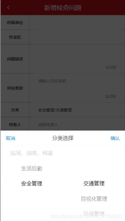
选择效果
以上这篇vue 公共列表选择组件,引用Vant-UI的样式方式就是小编分享给大家的全部内容了,希望能给大家一个参考,也希望大家多多支持。
以上是 vue 公共列表选择组件,引用Vant-UI的样式方式 的全部内容, 来源链接: utcz.com/p/218511.html