Element-UI 使用el-row 分栏布局的教程
使用多个卡片显示的时候,并且要求当列数到一定数目的时候,要自动换行,el-container 布局就满足了需求了,就要用到el-row 布局做分栏处理,
代码如下
<template>
<el-row :gutter="20" class="el-row" type="flex" >
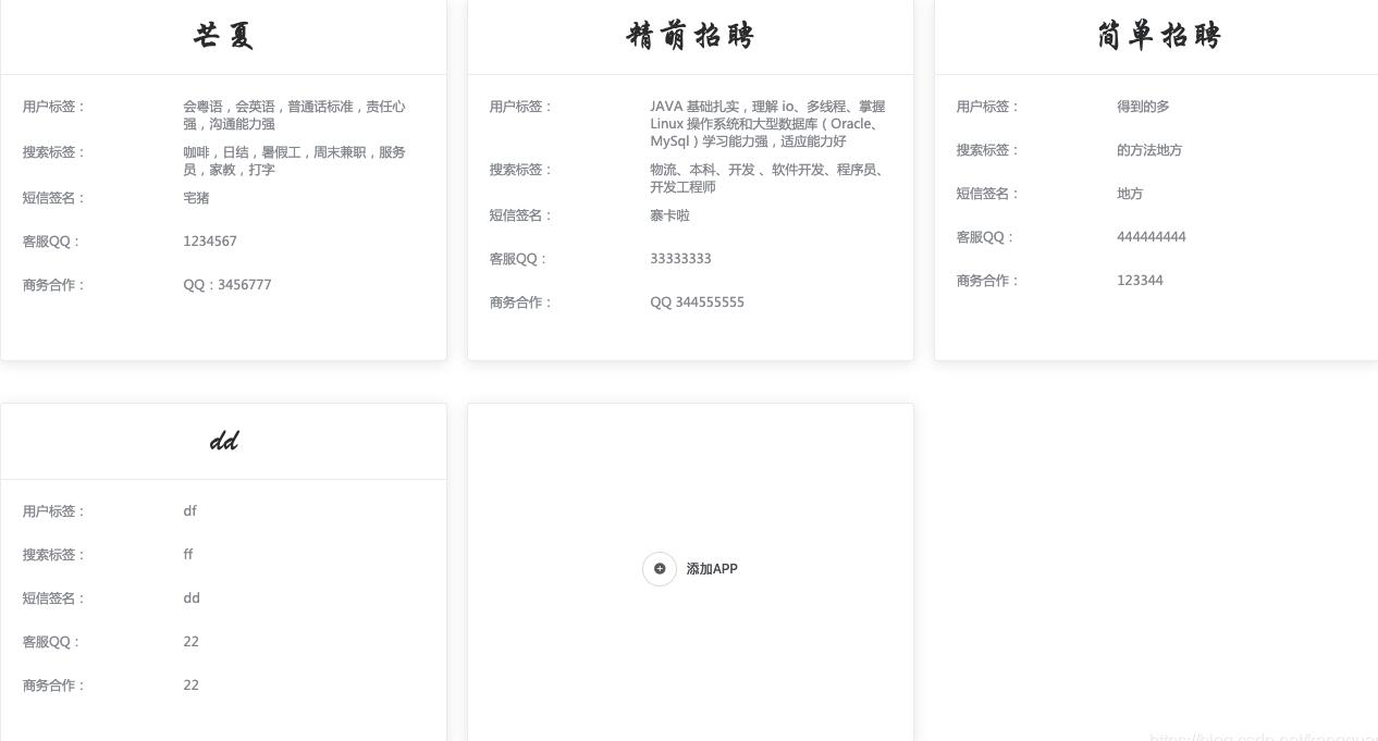
<el-col :span="8" v-for = "(item,index) in apps" :key="item.id" class="el-col" >
<el-card class="el-card" :key="index" onclick="">
<div slot="header" class="clearfix">
<span>{{item.appname}}</span>
</div>
<div >
<div class="text item">
<div class="item_tag" >
<span >用户标签:</span>
</div>
<div class="item_desr">
<span > {{item.tag}}</span>
</div>
</div>
<div class="text item">
<div class="item_tag">
<span>搜索标签:</span>
</div>
<div class="item_desr">
{{item.seatag}}
</div>
</div>
<div class="text item">
<div class="item_tag">
<span>短信签名:</span>
</div>
<div class="item_desr">
<span>
{{item.wxname}}
</span>
</div>
</div>
<div class="text item">
<div class="item_tag">
<span>客服QQ:</span>
</div>
<div class="item_desr">
{{item.qq}}
</div>
</div>
<div class="text item">
<div class="item_tag">
<span>商务合作:</span>
</div>
<div class="item_desr">
{{item.buscoo}}
</div>
</div>
</div>
</el-card>
</el-col>
<el-col :span="8">
<el-card class="box-card" style="min-height: 200px;" align="middle" onclick="">
<div class="el-card__body mid">
<el-button icon="el-icon-circle-plus" circle></el-button>
<el-button style="margin-left: 0;color: #505458" type="text">添加APP</el-button>
</div>
</el-card>
</el-col>
</el-row>
</template>
<script>
css
<style type="text/css">
.all{
margin-top: -30px;
word-break: break-all;
height: 100%;
}
.mid{
margin-top: 25%;
height: 50%;
}
.mid_item{
justify-content: center;
align-items: center;
}
.item {
margin-bottom: 10px;
}
.item_tag{
float:left;
text-align:left;
}
.item_desr{
margin-left: 40%;
min-height: 30px;
text-align:left;
}
.text {
width: 100%;
font-size: 12px;
font-family: "Microsoft YaHei";
color: #909399;
}
.clearfix:before,
.clearfix:after {
display: table;
content: "";
}
.clearfix:after {
clear: both
}
.el-card {
min-width: 100%;
height: 100%;
margin-right: 20px;
/*transition: all .5s;*/
}
.el-card:hover{
margin-top: -5px;
}
.el-row {
margin-bottom: 20px;
display: flex;
flex-wrap: wrap
}
.el-col {
border-radius: 4px;
align-items: stretch;
margin-bottom: 40px;
}
</style>
补充知识:vue element框架中el-row控件里按列排列失效问题的解决
最近我在使用vue的ui框架element-ui,可能是自己经验不足,遇到了很奇怪的问题,在这里特意把解决的步骤记录一下,希望能对大家有所帮助。
首先我使用的分栏间隔的布局方式,参照官网上的例子:
<el-row :gutter="20">
<el-col :span="6"><div class="grid-content bg-purple"></div></el-col>
<el-col :span="6"><div class="grid-content bg-purple"></div></el-col>
<el-col :span="6"><div class="grid-content bg-purple"></div></el-col>
<el-col :span="6"><div class="grid-content bg-purple"></div></el-col>
</el-row>
<style>
.el-row {
margin-bottom: 20px;
&:last-child {
margin-bottom: 0;
}
}
.el-col {
border-radius: 4px;
}
.bg-purple-dark {
background: #99a9bf;
}
.bg-purple {
background: #d3dce6;
}
.bg-purple-light {
background: #e5e9f2;
}
.grid-content {
border-radius: 4px;
min-height: 36px;
}
.row-bg {
padding: 10px 0;
background-color: #f9fafc;
}
</style>
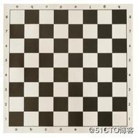
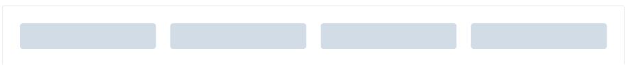
应该效果如下图:
但是我在参考例子后,代码如下:
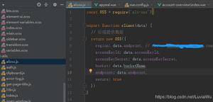
App.vue
<template>
<div id="app">
<el-row :gutter="20">
<el-col :span="6"><div class="grid-content bg-purple">1</div></el-col>
<el-col :span="6"><div class="grid-content bg-purple">1</div></el-col>
<el-col :span="6"><div class="grid-content bg-purple">1</div></el-col>
<el-col :span="6"><div class="grid-content bg-purple">1</div></el-col>
</el-row>
</div>
</template>
<style>
.el-row {
margin-bottom: 20px;
}
.el-col {
border-radius: 14px;
}
.bg-purple {
background: #d3dce6;
}
.grid-content {
border-radius: 14px;
min-height: 36px;
}
</style>
main.js
// The Vue build version to load with the `import` command
// (runtime-only or standalone) has been set in webpack.base.conf with an alias.
import Vue from 'vue'
import App from './App'
import router from './router'
import ElementUI from 'element-ui'//A Vue.js 2.0 UI Toolkit for Web
Vue.use(ElementUI);
Vue.config.productionTip = false
/* eslint-disable no-new */
new Vue({
el: '#app',
router,
components: { App },
template: '<App/>'
})
可是效果如下:
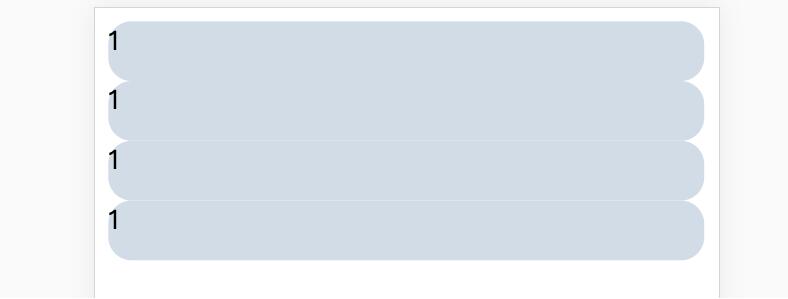
奇怪了,为何布局变成了纵向,明明row中的布局应该是按列排列的。经过排查发现自己少了这一行:import ‘element-theme-chalk';
也就是代码应该如下:
main.js
// The Vue build version to load with the `import` command
// (runtime-only or standalone) has been set in webpack.base.conf with an alias.
import Vue from 'vue'
import App from './App'
import router from './router'
import ElementUI from 'element-ui'//A Vue.js 2.0 UI Toolkit for Web
import 'element-theme-chalk';
Vue.use(ElementUI);
Vue.config.productionTip = false
/* eslint-disable no-new */
new Vue({
el: '#app',
router,
components: { App },
template: '<App/>'
})
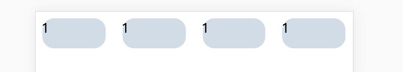
这个时候效果如下,应该是我们希望看到的,至少列生效了:
我看了一下文档,发现并没有特别指出这一行的配置,可能是我遗漏了或者其他的原因导致的,也有可能是官网没有标识出这一点。总之加上了这一行配置解决了我的问题。在这里做一个笔记,也希望能够帮助到遇到类似的问题的同学。
以上这篇Element-UI 使用el-row 分栏布局的教程就是小编分享给大家的全部内容了,希望能给大家一个参考,也希望大家多多支持。
以上是 Element-UI 使用el-row 分栏布局的教程 的全部内容, 来源链接: utcz.com/p/218368.html