css position absolute making the textbox go down
- I build a prototype using chips material-UI.
- When I click the Test IPA the textbox should show immediately below the text Test IPA.
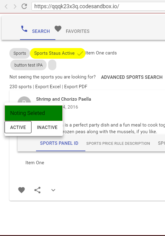
- In the prototype, it shows immediately below but whereas when I include with other functionalities, it's showing at the bottom.
- I debugged the CSS, its due to position absolute for each scenario it's showing different values and its coming from material UI.
- Can you tell me how to fix it with respect to other components?
- Providing my code snippet, sandbox and bug screenshot below.
Problem with other components
https://codesandbox.io/s/qqqk23x3q

Working properly individually
https://codesandbox.io/s/1y2mvo0ol3
JSX:
<td><ChipsTextbox chipName="test IPA" />
</td>
<Menu id="simple-menu" open={open} onClose={this.handleClose}>
<TextField onChange={this.onChange} onKeyDown={this.handleKeyPress} />
</Menu>
CSS:
.MuiPopover-paper-1706 {outline: none;
position: absolute;
min-width: 16px;
max-width: calc(100% - 32px);
overflow-y: auto;
overflow-x: hidden;
min-height: 16px;
max-height: calc(100% - 32px);
}
Answer
The parent element of the .MuiPopover-paper-1706 should have position: relative CSS attribute. If it doesn't then the element with position: absolute will be positioned relatively the nearest parent with relative positioning.
以上是 css position absolute making the textbox go down 的全部内容, 来源链接: utcz.com/a/24053.html


