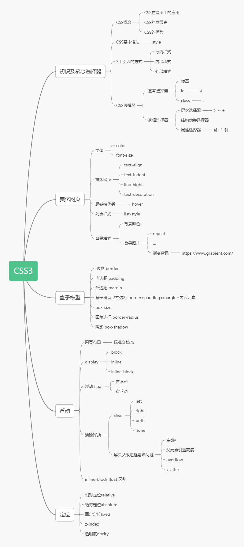
CSS3
CSS3
HTML+CSS+JavaScript
结构+表项+交互
如何学习?
- CSS是什么
- CSS怎么用(快速入门)
- CSS选择器(重点+难点)
- 美化网页(文字、阴影、超链接、列表、渐变...)
- 盒子模型
- 浮动
- 定位
- 网页动画(特效效果)
1、初识CSS
1.1、什么是CSS
Cascading Style Sheet(层叠样式表)
CSS:表现(美化网页)
字体、颜色、边距、高度、宽度、背景图片、网页定位、网页浮动...
1.2、发展史
CSS1.0
CSS2.0 DIV(块)+CSS,HTML与CSS结构分离,网页变得简单,利于SEO
CSS2.1 浮动和定位
CSS3.0 圆角边框、阴影、动画.... 浏览器兼容性
1.3、快速入门
<!DOCTYPE html><html lang="en">
<head>
<meta charset="UTF-8">
<title>Title</title>
<!-- 规范 <style></style>内可以编写html代码,每一个声明最好以分号结尾
语法:
选择器{
声明1: ;
声明2: ;
声明3: ;
}
-->
<style>
h1{
color:red;
}
</style>
</head>
<body>
<h1>我是标题</h1>
</body>
</html>
建议使用这种规范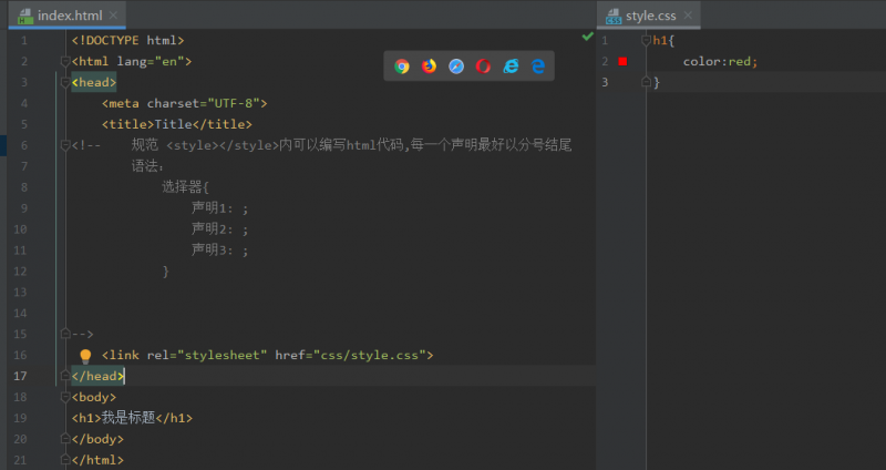
CSS优势:
- 内容和表现分离
- 网页结构表现统一,可以实现复用
- 样式十分丰富
- 建议使用独立于HTML的css文件
- 利于SEO,容易被搜索引擎收录
1.4、css的三种导入方式
<!DOCTYPE html><html lang="en">
<head>
<meta charset="UTF-8">
<title>Title</title>
<!--2.内部样式表-->
<style>
h1{
color:green;
}
</style>
<!--3.外部样式-->
<link rel="stylesheet" href="https://www.cnblogs.com/P935074243/archive/2020/06/05/css/style.css">
</head>
<body>
<!--优先级:就近原则-->
<!--1.行内样式:在标签元素中编写一个style属性,编写样式即可-->
<h1>我是标题</h1>
</body>
</html>
拓展:外部样式两种写法:
链接式:
<!--外部样式--><link rel="stylesheet" href="https://www.cnblogs.com/P935074243/archive/2020/06/05/css/style.css">
导入式:
@import是CSS2.1特有的
<!--导入式--><style>
@import url("style.css");
</style>
2、选择器
作用:选择页面上的某一种元素或者某一类元素
2.1、基本选择器
2.1.1、标签选择器
选择一类标签
语法:
<标签名></标签名>
标签名{
声明1:;
声明2:;
}
<!DOCTYPE html><html lang="en">
<head>
<meta charset="UTF-8">
<title>Title</title>
<style>
/*标签选择器会选中页面上的所有这个标签*/
h1{
color: #dcff4f;
background: deepskyblue;
border-radius: 14px;
}
p{
font-size: 80px;
}
</style>
</head>
<body>
<h1>学Java</h1>
<h1>学Java</h1>
<p>狂神说</p>
</body>
</html>
2.1.2、类选择器 class
选中所有class属性一致的标签,可以跨标签
语法:
.类名{
声明1:;
声明2:;
}
<!DOCTYPE html><html lang="en">
<head>
<meta charset="UTF-8">
<title>Title</title>
<style>
/*类选择器格式:.class的名称{}
好处:可以多个标签归类,是同一个class,可以复用
*/
.one{
color:wheat;
}
.two{
color:red;
}
.three{
}
</style>
</head>
<body>
<h1 class="one">标题1</h1>
<h1 class="two">标题2</h1>
<h1 class="three">标题3</h1>
</body>
</html>
2.1.3、id选择器
全局唯一
语法:
#id名{
声明1:;
声明2:;
}
<!DOCTYPE html><html lang="en">
<head>
<meta charset="UTF-8">
<title>Title</title>
<style>
/*id选择器格式:#id名称{} id必须保证全局唯一
不遵循就近原则,固定的:id选择器>类选择器>标签选择器
*/
#one{
color: aquamarine;
}
.style1{
color:red;
}
h1{
color: #dcff4f;
}
</style>
</head>
<body>
<h1 id="one" class="style1">标题1</h1>
<h1 class="style1">标题2</h1>
<h1 class="style1">标题3</h1>
<h1>标题4</h1>
<h1>标题5</h1>
</body>
</html>
优先级:不遵循就近原则,固定的:id选择器>类选择器>标签选择器
2.2、层次选择器
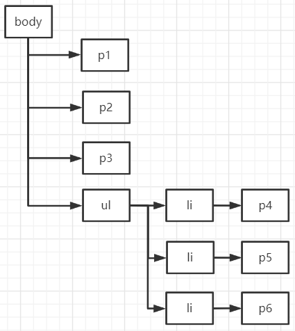
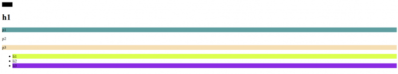
HTML
<body><p>p0</p>
<p class="active">p1</p>
<p>p2</p>
<p>p3</p>
<ul>
<li>
<p>p4</p>
</li>
<li>
<p>p5</p>
</li>
<li>
<p>p6</p>
</li>
</ul>
</body>
2.2.1、后代选择器
在某个元素的后面 :祖爷爷 爷爷 爸爸 我
/*后代选择器*/body p{
background: red;
}
2.2.2、子选择器
只有当前选择的下一代
/*子选择器*/body > p{
background: blueviolet;
}
2.2.3、相邻兄弟选择器
同辈 对下不对上,只有一个
/*相邻兄弟选择器*/.active + p{
background: cadetblue;
}
2.2.4、通用选择器
当前选中元素的向下的所有元素
/*通用兄弟选择器*/.active ~ p{
background: green;
}
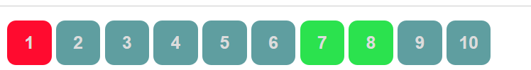
2.3、结构伪类选择器
伪类:条件
<!DOCTYPE html><html lang="en">
<head>
<meta charset="UTF-8">
<title>Title</title>
<!--避免使用class和id选择器-->
<style>
/*ul的第一个子元素*/
ul li:first-child{
background: #dcff4f;
}
/*ul的第最后一个子元素*/
ul li:last-child{
background: blueviolet;
}
/*选中p1:定位到父元素,选中当前的第一个元素
选中当前元素的父级元素,选中父级元素的第n个,但第n个元素必须是是当前元素,否则选不中
*/
p:nth-child(3){
background: cadetblue;
}
/*先选中当前元素的父级元素,然后选中父级元素的第n个和当前元素同类型的元素*/
p:nth-of-type(3){
background: wheat;
}
/*鼠标移动到上面会发生变化*/
a:hover{
background: black;
}
</style>
</head>
<body>
<a>12231</a>
<h1>h1</h1>
<p>p1</p>
<p>p2</p>
<p>p3</p>
<ul>
<li>li1</li>
<li>li2</li>
<li>li3</li>
</ul>
</body>
</html>
2.4、属性选择器(常用)
class+id结合
- 属性名
- 属性名 = 属性值(正则)
- **= 绝对等于 **
- *= 包含
- ^= 以...开头
- $= 以...结尾
<!DOCTYPE html><html lang="en">
<head>
<meta charset="UTF-8">
<title>Title</title>
<style>
.demo a{
float: left;
display: block;
height: 50px;
width: 50px;
border-radius: 10px;
background: blue;
text-align: center;
color: gainsboro;
text-decoration: none;
margin-right: 5px;
font: bold 20px/50px Arial;
}
/*
1.属性名
2.属性名=属性值(正则)
3.= 绝对等于 *= 包含
4.^= 以...开头
5.$= 以...结尾
*/
/*选中存在id属性的元素 a[]{} */
a[id]{
background: #2be24e;
}
/*选中id=first*/
a[id=first]{
background: #ff0b2f;
}
/*class中有link的*/
a[class *= "link"]{
background: cadetblue;
}
/*选中href中以http开头的*/
a[href^=http]{
background: #ff0b2f;
}
/* 选中href中以pdf结尾的*/
a[href$=pdf]{
background: #2be24e;
}
</style>
</head>
<body>
<p class="demo">
<a href="http://www.baidu.com/" class="link item first" id="first">1</a>
<a href="" class="links item active" target="_blank" title="test">2</a>
<a href="https://www.cnblogs.com/P935074243/archive/2020/06/05/images/123.html" class="link item">3</a>
<a href="https://www.cnblogs.com/P935074243/archive/2020/06/05/images/123.png" class="link item">4</a>
<a href="https://www.cnblogs.com/P935074243/archive/2020/06/05/images/123.jpg" class="link item">5</a>
<a href="https://www.cnblogs.com/P935074243/archive/2020/06/05/abc" class="link item">6</a>
<a href="https://www.cnblogs.com/a.pdf" class="link item">7</a>
<a href="https://www.cnblogs.com/abc.pdf" class="link item">8</a>
<a href="https://www.cnblogs.com/P935074243/archive/2020/06/05/abc.doc" class="link item">9</a>
<a href="https://www.cnblogs.com/P935074243/archive/2020/06/05/abcd.doc" class="link item last">10</a>
</p>
</body>
</html>
3、美化网页元素
3.1、为什么要美化网页
- 有效的传递页面信息
- 美化网页,页面漂亮才能吸引用户
- 凸显页面主题
- 提高用户体验
span标签:重点要突出的字,使用span套起来
<!DOCTYPE html><html lang="en">
<head>
<meta charset="UTF-8">
<title>Title</title>
<style>
#title1{
font-size: 50px;
}
</style>
</head>
<body>
欢迎学习<span id="title1">java</span>
</body>
</html>
3.2、字体样式
<!--font-family: 字体
font-size: 字体大小
font-weight: 字体粗细
color: 字体颜色
-->
<style>
body{
font-family: "Arial Black", 楷体;
}
h1{
font-size: 50px;
color: #ff0b2f;
}
.p1{
font-weight: bold;
}
</style>
<!--字体风格-->
<style>
p{
font: oblique bolder 16px "楷体" ;
}
</style>
3.3、文本样式
颜色 color: rgb/rgba/单词;
对齐方式 text-align: center;水平居中
首行缩进 text-indent: 2em;
行高 height: 300px;块高
line-height: 300px;行高
行高和块高度一致,就可以实现单行文本上下居中
装饰划线 text-decoration:
文本图片水平对齐 vertical-align: middle;
<!DOCTYPE html><html lang="en">
<head>
<meta charset="UTF-8">
<title>Title</title>
<!--
颜色:
单词
RGB:0~F
RGBA :A:0~1
text-align: center;排版 水平居中
text-indent: 2em;段落首行缩进
height: 300px;
line-height: 300px;行高和块高度一致,就可以上下居中
-->
<style>
h1{
color: rgba(0,255,255,0.9);
text-align: center;/*文本居中*/
}
.p1{
text-indent: 2em;
}
.p3{
background: blue;
height: 300px;
line-height: 300px;
}
/*下划线*/
.l1{
text-decoration: underline;
}
/*中划线*/
.l2{
text-decoration: line-through;
}
/*上划线*/
.l3{
text-decoration: overline;
}
/*超链接去下划线*/
a{
text-decoration: none;
}
/*水平对齐 参照物, a b */
img,span{
vertical-align: middle;
}
</style>
</head>
<body>
<a href="">123</a>
<p class="l1">123123</p>
<p class="l2">123123</p>
<p class="l3">123123</p>
<h1>《魁拔》</h1>
<p class="p1">
是2008年北京青青树动漫科技有限公司以系列动画电影的第一部《魁拔之十万火急》为基础,重新剪辑而成的TV动画。
由王川执导,田博、马华等编剧,刘婧荦,竹内顺子等配音。
</p>
<p class="p3">
TV版完整保留了电影的世界观、人物设定、故事内容和情节主线,但重制了片头曲。
《魁拔妖侠传》是魁拔系列电影的前传,主要讲述的是有关卡拉肖克潘家族的故事,与电影关系并不大。
目前大家所说的魁拔通常指魁拔系列动画电影。
</p>
<p>
<img src="https://www.cnblogs.com/P935074243/archive/2020/06/05/a.png" alt="">
<span>jdlajsdajldjalsjd</span>
</p>
</body>
</html>
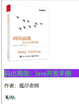
3.4、超链接伪类和阴影
<!DOCTYPE html><html lang="en">
<head>
<meta charset="UTF-8">
<title>Title</title>
<style>
/*默认颜色*/
a{
text-decoration: none;
color: black;
}
/*鼠标悬浮的状态*/
a:hover{
color: orange;
font-size: 20px;
}
/*鼠标按住未释放状态*/
a:active{
color: #2be24e;
}
/*text-shadow:阴影颜色 水平偏移 垂直偏移 阴影半径*/
#price{
text-shadow: cadetblue 5px 5px 1px;
}
p:hover{
background: blueviolet;
}
</style>
</head>
<body>
<a href="#">
<img src="https://www.cnblogs.com/P935074243/archive/2020/06/05/images/1.jpg" alt="">
</a>
<p>
<a href="#">码出高效:Java开发手册</a>
</p>
<p>
<a href="#">作者:孤尽老师</a>
</p>
<p id="price">¥99</p>
</body>
</html>
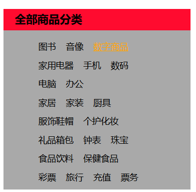
3.5、列表
#nav{width: 300px;
background: darkgrey;
}
.title{
font-size: 18px;
font-weight: bold;
text-indent: 1em;
line-height: 35px;
background: #ff0b2f;
}
/*
list-style:
none;去掉圆点
circle;空心圆
decimal:数字
square:正方形
*/
/*ul{*/
/* background: darkgrey;*/
/*}*/
ul li{
height: 30px;
list-style: none;
text-indent: 1em;
}
a{
text-decoration: none;
font-size: 14px;
color: black;
}
a:hover{
color: orange;
text-decoration: underline;
}
3.6、背景图像
背景颜色
背景图片
div{width: 1400px;
height: 700px;
border: 1px solid red;
background-image: url("https://www.cnblogs.com/P935074243/archive/2020/06/05/images/1.jpg");
/*默认平铺*/
}
.div1{
background-repeat: repeat-x;/*水平平铺*/
}
.div2{
background-repeat: repeat-y;/*竖直平铺*/
}
.div3{
background-repeat: no-repeat;/*不平铺*/
}
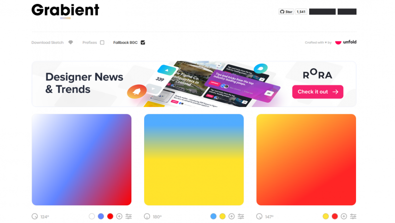
3.7、渐变
推荐网站:https://www.grabient.com/
background-color: #FFFFFF;background-image: linear-gradient(124deg, #FFFFFF 0%, #6284FF 50%, #FF0000 100%);
4、盒子模型
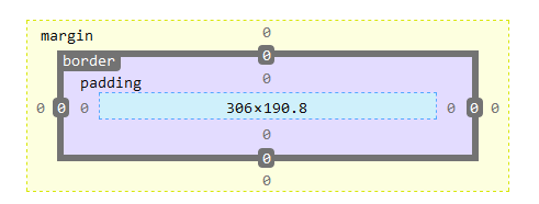
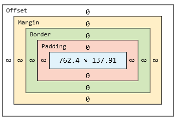
4.1、什么是盒子
- margan:外边距
- padding:内边距
- border:边框
4.2、边框
- 边框的粗细
- 边框的样式
- 边框的颜色
/*body总有一个默认的外边距margin:8dp*/body{
margin: 0;
}
#app{
width: 300px;
border: 1px solid red;/*粗细 样式 颜色*/
}
h2{
font-size: 16px;
background: cadetblue;
line-height: 30px;
margin: 0;
color: #FFFFFF;
}
form{
background: cadetblue;
}
div:nth-of-type(1) input{
border: 3px solid black;
}
div:nth-of-type(2) input{
border: 3px dashed #be0be2;
}
div:nth-of-type(2) input{
border: 2px dashed #2be24e;
}
4.3、内外边距
<!--外边距可以使居中--><style>
/*body总有一个默认的外边距margin:8dp*/
body{
margin: 0;
}
/* margin:0;一个参数为上下左右
margin: 0 auto;上下为0,左右自动,实现水平居中
margin:0 1px 2px 3px;四个参数为上右下左,顺时针
*/
#app{
width: 300px;
border: 1px solid red;/*粗细 样式 颜色*/
margin: 0 auto;
}
h2{
font-size: 16px;
background: cadetblue;
line-height: 30px;
margin: 0;
color: #FFFFFF;
}
form{
background: cadetblue;
}
input{
border: 1px solid black;
}
div:nth-of-type(1){
padding: 10px;
}
盒子的计算方式:这个元素到底多大?
margin+border+padding+内容宽度
4.4、圆角边框
<!DOCTYPE html><html lang="en">
<head>
<meta charset="UTF-8">
<title>Title</title>
<!-- border-radius: 50px 20px;左上右下 右上左下-->
<!--圆圈:圆角 = 宽度的一半 -->
<style>
div{
width: 100px;
height: 50px;
border: 10px solid red;
border-radius: 100px 100px 0 0;
}
img{
border-radius: 100px;
}
</style>
</head>
<body>
<div></div>
<img src="https://www.cnblogs.com/P935074243/archive/2020/06/05/images/1.jpg" alt="">
</body>
</html>
4.5、盒子阴影
<!DOCTYPE html><html lang="en">
<head>
<meta charset="UTF-8">
<title>Title</title>
<!--
margin:0 auto;居中要求:外面是一个块元素,块元素有固定的宽度
-->
<style>
div{
width: 1000px;
height: 500px;
text-align: center;
}
img{
border-radius: 100px;
box-shadow: 10px 10px 100px yellow;
margin: 0 auto;
text-align: center;
}
</style>
</head>
<body>
<div>
<img src="https://www.cnblogs.com/P935074243/archive/2020/06/05/images/1.jpg" alt="">
</div>
</body>
</html>
5、浮动
5.1、标准文档流
块级元素:独占一行
h1~h6 p div 列表...行内元素:不独占一行
span a img span...行内元素可以被包含在块级元素中,反之则不可以
5.2、display
<!--display:block;块元素
inline;行内元素
inline-block;是块元素,但是可以内联,在同一行
none;不显示
-->
<style>
div{
width: 100px;
height: 100px;
border: red solid 1px;
display: inline;
}
span{
width: 100px;
height: 100px;
border: red solid 1px;
display: inline-block;
}
</style>
这个也是一种能够实现行内元素排列的方式,但是我们很多情况都使用float
5.3、float
左右浮动
div{margin: 10px;
padding: 5px;
}
#father{
border: 1px solid red;
}
.layer01{
border: 1px dashed black;
display: inline-block;
float: left;
}
.layer02{
border: 1px dashed green;
display: inline-block;
float: left;
}
.layer03{
border: 1px dashed blue;
display: inline-block;
float: left;
}
.layer04{
border: 1px dashed paleturquoise;
font-size: 12px;
line-height: 23px;
display: inline-block;
float: left;
clear: both;
}
5.4、父级边框塌陷问题
clear
clear:right; 右侧不允许有浮动元素
left; 左侧不允许有浮动元素
both;两侧都不允许有浮动元素
解决方案:
增加父级元素高度
#father{border: 1px solid red;
height: 800px;
}
增加一个空的div标签,清除浮动
<div class="clear"></div>.clear{
clear: both;
margin: 0;
padding: 0;
}
overflow
在父级元素中增加一个 overflow: hidden;父类添加一个伪类 after
#father:after{content: '';
display: block;
clear: both;
}
小结:
- 浮动元素后面增加空的div
- 简单,代码中尽量避免空的div
- 设置父元素的高度
- 简单,元素假设有了固定的高度,就会被限制
- overflow
- 简单,下拉的一些场景避免使用
- 父类添加一个伪类:after(推荐)
- 写法稍微复杂一点,但是没有副作用,推荐使用
- 浮动元素后面增加空的div
5.5、对比
display
方向不可控制
float
浮动起来会脱离标准文档流,所以要解决父级塌陷的问题
6、定位
6.1、相对定位
相对定位:position: relative;
相对于原来的位置,进行指定的偏移,相对定位的话,它任然在标准文档流中,原来的位置会被保留
top: -20px;left: 20px;
bottom: -10px;
right: 20px;
<!DOCTYPE html><html lang="en">
<head>
<!--相对定位:相对于自己原来的位置进行定位-->
<meta charset="UTF-8">
<title>Title</title>
<style>
body{
padding: 20px;
}
div{
margin: 10px;
padding: 5px;
font-size: 12px;
line-height: 15px;
}
#father{
border: 1px solid red;
padding: 0;
}
#first{
background-color: #23ff66;
border: 1px dashed #23ff98;
position: relative;/*相对定位:上下左右*/
top: -20px;
left: 20px;
}
#second{
background-color: #34cedd;
border: 1px dashed #34ceff;
}
#third{
background-color: #ff8299;
border: 1px dashed #ff82fc;
position: relative;
bottom: -10px;
right: 20px;
}
</style>
</head>
<body>
<div id="father">
<div id="first">第一个盒子</div>
<div id="second">第二个盒子</div>
<div id="third">第三个盒子</div>
</div>
</body>
</html>
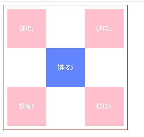
练习:方块定位
<!DOCTYPE html><html lang="en">
<head>
<meta charset="UTF-8">
<title>Title</title>
<style>
#box{
width: 300px;
height: 300px;
border: red 1px solid;
padding: 10px;
}
a{
width: 100px;
height: 100px;
text-decoration: none;
background: pink;
line-height: 100px;
text-align: center;
color: #FFFFFF;
display: block;
}
a:hover{
background: #6284FF;
}
.a2,.a4{
position: relative;
left: 200px;
top: -100px;
}
.a5{
position: relative;
top: -300px;
right: -100px;
}
</style>
</head>
<body>
<div id="box">
<a href="#" class="a1">链接1</a>
<a href="#" class="a2">链接2</a>
<a href="#" class="a3">链接3</a>
<a href="#" class="a4">链接4</a>
<a href="#" class="a5">链接5</a>
</div>
</body>
</html>
6.2、绝对定位
定位:基于xxx定位,上下左右
- 没有父级元素定位的前提下,相对于浏览器定位
- 假设父级元素存在定位,通常相对于父级元素进行偏移
- 在父级元素范围内移动
相对于父级或者浏览器的位置,进行指定的偏移,绝对定位的话,它不在在标准文档流中,原来的位置不会被保留
<!DOCTYPE html><html lang="en">
<head>
<meta charset="UTF-8">
<title>Title</title>
<style>
div{
margin: 10px;
padding: 5px;
font-size: 12px;
line-height: 15px;
}
#father{
border: 1px solid red;
padding: 0;
position: relative;
}
#first{
background-color: #23ff66;
border: 1px dashed #23ff98;
}
#second{
background-color: #34cedd;
border: 1px dashed #34ceff;
position: absolute;
right: 30px;
}
#third{
background-color: #ff8299;
border: 1px dashed #ff82fc;
}
</style>
</head>
<body>
<div id="father">
<div id="first">第一个盒子</div>
<div id="second">第二个盒子</div>
<div id="third">第三个盒子</div>
</div>
</body>
</html>
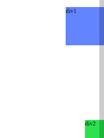
6.3、固定定位 fixed
<!DOCTYPE html><html lang="en">
<head>
<meta charset="UTF-8">
<title>Title</title>
<style>
body{
height: 1000px;
}
div:nth-of-type(1){ /*绝对定位,相对于浏览器初始位置*/
width: 100px;
height: 100px;
background: #6284FF;
position: absolute;
right: 0;
bottom: 0;
}
div:nth-of-type(2){/*fixed,固定定位*/
width: 50px;
height: 50px;
background: #2be24e;
position: fixed;
right: 0;
bottom: 0;
}
</style>
</head>
<body>
<div>div1</div>
<div>div2</div>
</body>
</html>
6.4、z-index
图层~
z-index:默认是0,最高无限制
<!DOCTYPE html><html lang="en">
<head>
<meta charset="UTF-8">
<title>Title</title>
<link rel="stylesheet" href="https://www.cnblogs.com/P935074243/archive/2020/06/05/css/style.css">
</head>
<body>
<div id="content">
<ul>
<li><img src="https://www.cnblogs.com/P935074243/archive/2020/06/05/images/2.jpg" alt=""></li>
<li class="tipText">大家好</li>
<li class="tipBg"></li>
<li>时间:2099-1-1</li>
<li>地点:月球一号基地</li>
</ul>
</div>
</body>
</html>
opacity: 0.5;/背景透明度/
#content{width: 380px;
padding: 0;
margin: 0;
overflow: hidden;
font-size: 12px;
line-height: 25px;
border: 1px solid red;
}
ul,li{
margin: 0;
padding: 0;
list-style: none;
}
/*父级元素相对定位*/
#content ul{
position: relative;
}
.tipText,.tipBg{
position: absolute;
width: 380px;
height: 25px;
top: 200px;
}
.tipBg{
background: #05e29b;
opacity: 0.5;/*背景透明度*/
}
.tipText{
z-index: 999;
}
7、动画
8、总结
本文是学习B站“遇见狂神说”的课程所做的笔记,有需要的可以去B站关注这个宝藏男孩
以上是 CSS3 的全部内容, 来源链接: utcz.com/a/21505.html