【CSS】css3 形状,图形
小白敢问大神们
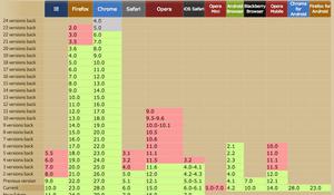
使用CSS3如何实现这个图形,左边的那一点点可以无视。
谢谢各位大佬了
回答:
这个如果按照图片上的效果把阴影也加上,不好实现,也没必要(如果这么复杂,直接要美工出图)
不加阴影的
<div class="test"></div>.test{
width: 800px;
height: 200px;
position: relative;
background: linear-gradient(red 5%, blue 5%, blue 95%,red 95%);
overflow: hidden;
margin: 10px;
}
/*
* 大圆
留四分之一圆,90度,那么宽高为(父元素高度-20)的根2倍
top为10 - ((父元素高度-20)的根2倍 - (父元素高度-20))/2
left没想公式,慢慢调的
* */
.test:after{
content: '';
width: 254.55844122715712px;
height: 254.55844122715712px;
border-radius: 50%;
background: red;
position: absolute;
top:-27.27922061357856px;
left:-217px;
z-index: 1;
}
/*
小圆
* */
.test:before{
content: '';
width: 254.55844122715712px;
height: 254.55844122715712px;
border-radius: 50%;
background: blue;
position: absolute;
top:-27.27922061357856px;
left:-227px;
z-index: 2;
}
以上是 【CSS】css3 形状,图形 的全部内容, 来源链接: utcz.com/a/155841.html