Vue封装Swiper实现图片轮播效果
图片轮播是前端中经常需要实现的一个功能。最近学习Vue.js,就针对Swiper进行封装,实现一个简单的图片轮播组件。
一、Swiper
在实现封装之前,先介绍一下Swiper。
- Swiper是纯Javascript打造的滑动特效插件,面向手机、平板电脑等移动终端。
- Swiper能实现触屏焦点图、触屏Tab切换、触屏多图切换等常用效果。
- Swiper开源、免费、稳定、使用简单、功能强大,是架构移动终端网站的重要选择。
Swiper的应用场景广泛,实现效果很好,下面个这实际案例就是Swiper的典型应用场景。
Swiper的具体使用教程及详细API,参考 Swiper中文网
。
二、Vue组件
Vue组件设计初衷就是要配合使用的,提高维护性和复用性。而图片轮播正适合使用组件来完成,因此在介绍具体的实现之前,先介绍下关于Vue组件及组件通信。
Vue组件中最常见的就是形成父子组件的关系:组件 A 在它的模板中使用了组件 B。
它们之间必然需要相互通信:父组件可能要给子组件下发数据,子组件则可能要将它内部发生的事情告知父组件。然而,通过一个良好定义的接口来尽可能将父子组件解耦也是很重要的。这保证了每个组件的代码可以在相对隔离的环境中书写和理解,从而提高了其可维护性和复用性。
在 Vue 中,父子组件的关系可以总结为 prop 向下传递,事件向上传递。父组件通过 prop 给子组件下发数据,子组件通过事件给父组件发送消息。
三、封装实现
1.引入Swiper
首先,需要安装Swiper。
npm install --save swiper
然后,要引用两个文件。
import Swiper from "swiper";
import "swiper/dist/css/swiper.min.css";
2.HTML代码
在模板中设置轮播图的html布局。
<template>
<div class="swiper-container" :class="swipeid">
<div class="swiper-wrapper">
<!-- 存放具体的轮播内容 -->
<slot name ="swiper-con"></slot>
</div>
<!-- 分页器 -->
<div :class="{'swiper-pagination':pagination}"></div>
</div>
</template>
其中使用具名插槽,提高解耦,使得在父组件使用时,根据不同情况,设置不同的轮播内容。
另外需要设置分页器,即图片轮播中的页面指示器,常见的如小圆点,或者数字指示器。
3.初始化Swiper
既然是对Swiper进行封装实现轮播图,前面也已经安装了Swiper,那么现在就需要初始化使用。
在初始化之前,根据Swiper用法的了解,先确定轮播组件需要的属性信息,然后通过父组件传递给封装的Swiper组件。
这时候就需要用到props。
props: {
swipeid: {
type: String,
default: ""
},
effect: {
type: String,
default: "slide"
},
loop: {
type: Boolean,
default: false
},
direction: {
type: String,
default: "horizontal"
},
pagination: {
type: Boolean,
default: true
},
paginationType: {
type: String,
default: "bullets"
},
autoPlay: {
type: Number,
default: 3000
}
}
下面逐一解释每个属性的含义。
| 属性 | 含义 |
|---|---|
| swiped | 轮播容器class属性的类名。 |
| effect | 图片的 切换效果,默认为"slide",还可设置为"fade", "cube", "coverflow","flip",详情见effect。 |
| loop | 设置为true 则开启loop模式。loop模式:会在原本图片前后复制若干个图片并在合适的时候切换,让Swiper看起来是循环的,详情见loop。 |
| direction | 图片的滑动方向,可设置水平(horizontal)或垂直(vertical),详情见direction。 |
| pagination | 使用分页导航,详情见pagination。 |
| paginationType | 分页器样式类型,可设置为"bullets", "fraction", "progressbar", "custom",详情见type。 |
| autoPlay | 设置为true启动自动切换,并使用默认的切换设置,详情见autoplay。 |
了解了上面每个属性的含义,下面就可以初始化Swiper,并设置具体的属性。
初始化Swiper时,需要传入两个参数。
- 轮播容器的类名
- 代表图片轮播组件详细功能的对象
var that = this;
this.dom = new Swiper("." + that.swipeid, {
//循环
loop: that.loop,
//分页器
pagination: {
el: ".swiper-pagination",
bulletClass : 'swiper-pagination-bullet',
},
//分页类型
paginationType: that.paginationType,
//自动播放
autoPlay: that.autoPlay,
//方向
direction: that.direction,
//特效
effect: that.effect,
//用户操作swiper之后,不禁止autoplay
disableOnInteraction: false,
//修改swiper自己或子元素时,自动初始化swiper
observer: true,
//修改swiper的父元素时,自动初始化swiper
observeParents: true
});
}
四、自定义轮播效果
经过上面的步骤,轮播器就封装好了。我们可以自定义实现自己想要的轮播器效果。下面以知乎的API为例,实现图片轮播。
1.HTML代码
<m-swipe swipeid="swipe" ref="swiper" :autoPlay="3000" effect="slide">
<div v-for="top in tops" :key="top.id" class="swiper-slide" slot="swiper-con" >
<img :src="top.image">
<h3>{{top.title}}</h3>
</div>
</m-swipe>
首先要引用注册组件,这里就不详细写出。
其中 m-swipe 就是前面实现的图片轮播组件,而其中的子组件就是通过具名插槽插入的轮播内容。
2.CSS代码
.swiper-container {
width: 100%;
}
.swiper-slide {
height: 8rem;
overflow: hidden;
position: relative;
}
.swiper-slide {
div {
top: 0;
left: 0;
width: 100%;
height: 100%;
opacity: 0.4;
position: absolute;
background-color: @blue;
}
img {
top: 50%;
position: relative;
transform: translate(0, -50%);
}
h3 {
width: 70%;
color: #fff;
margin: 0;
font-size: 0.5rem;
line-height: 1rem;
right: 5%;
bottom: 2.6rem;
text-align: right;
position: absolute;
text-shadow: 1px 1px 10px rgba(0, 0, 0, 0.5);
&:before {
content: "";
width: 3rem;
bottom: -0.6rem;
right: 0;
display: block;
position: absolute;
border: 2px solid @yellow;
}
}
}
.swiper-pagination-bullet-active {
background: #fff;
}
.swiper-container-horizontal > .swiper-pagination-bullets {
bottom: 1rem;
width: 95%;
text-align: right;
}
其中 swiper-pagination-bullet-active 代表分页器中当前指示的小圆点的类名。 .swiper-pagination-bullets 代表分页器的类名,详情见pagination分页器内元素的类名 。
关于网络请求数据展示的代码就不贴了,下面有源码地址。
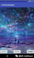
3.效果
这只是一个简单的封装效果,想要实现更多的效果,可以通过Swiper中提供的更多功能来实现。
Github地址: 图片轮播
总结
以上所述是小编给大家介绍的Vue封装Swiper实现图片轮播效果,希望对大家有所帮助,如果大家有任何疑问请给我留言,小编会及时回复大家的。在此也非常感谢大家对网站的支持!
以上是 Vue封装Swiper实现图片轮播效果 的全部内容, 来源链接: utcz.com/z/361397.html