vue.js移动端tab组件的封装实践实例
这是vue.js" title="vue.js">vue.js系列文章第二遍,第一篇讲述的是如何搭建vue.js的开发环境,计划按进度做成一款完整的app,当然前提是时间允许的话。本文用到了stylus语法,至于为什么使用stylus而不去用sass,主要是因为stylus来自于Node.js社区。总之stylus是一款高效的CSS预处理器,具体使用不在本文讨论范围。好了,废话不说了,下面讲述怎么封装tababr的切换。
底部tab进行页面切换,会用到vue里面的路由,也就是vue-router
我们在安装vue-cli时选中默认安装vue-router即可。
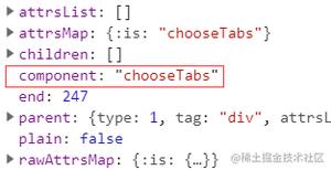
安装完毕后,打开我的项目,我们需要在router目录的index.vue中配置路由信息,具体配置信息如下
从上面图片,我们可以看到,我们一共配置了4子页面,其中redirect为配置默认组件的路由。
路由配置完成后,我们需要封装tab组件了
因为tab组件属于基础组件,所以我们新建了文件夹tab,然后在tab文件夹下面新建了tabbar组件和tababritem组件。我们先说tababritem组件的封装
tabbaritem封装
我们知道tababritem有一张正常显示图片,选中后的图片,和图片下的文字,其中属性id用来记录当前tabbaritem的组件名,属性isRouter用来记录当前选中是否是这个tababritem。
<template>
<a class="m-tabbar-item" :class="{'is-active':isActive}" @click="goToRouter">
<div class="m-tabbar-item-icon" v-show="!isActive"><slot name="icon-normal"></slot></div>
<div class="m-tabbar-item-icon" v-show="isActive"><slot name="icon-active"></slot></div>
<div class="m-tabbar-item-text"><slot></slot></div>
</a>
</template>
<script type="text/ecmascript-6">
export default{
props: {
id: {
type: String
},
isRouter: {
type: Boolean,
default: false
}
},
computed: {
isActive () {
return this.isRouter
}
},
methods: {
goToRouter () {
this.$parent.$emit('tabbarActionEvent', this.id)
// 判断是否为路由跳转
this.$router.push(this.id)
}
}
}
</script>
<style scoped lang="stylus" rel="stylesheet/stylus">
.m-tabbar-item
flex: 1
text-align: center
.m-tabbar-item-icon
padding-top: 5px
padding-bottom 1px
img
width: 24px
height: 24px
.m-tabbar-item-text
font-size: 8px
color:#949494
&.is-active
.m-tabbar-item-text
color: #fa3e25
</style>
接下来,我们要封装tababr,tabbar里面需要包含tabbaritem,主要设置了下tabbar的样式,具体代码如下
tabbar的封装
<template>
<div class="m-tabbar">
<slot></slot>
</div>
</template>
<script type="text/ecmascript-6">
export default {}
</script>
<style scoped lang="stylus" rel="stylesheet/stylus">
.m-tabbar
display: flex
flex-direction: row
position: fixed
bottom: 0
left: 0
right: 0
width: 100%
overflow: hidden
height: 50px
background: #fff
border-top: 1px solid #e4e4e4
</style>
最后在我们的app.vue里面引用tabbar组件,监听子类tabbaritem的点击方法,来控制当前哪个item的选中颜色文字的改变
app.vue代码
<template>
<div id="app">
<router-view></router-view>
<m-tabbar @tabbarActionEvent='changeSelectedValue'>
<m-tabbar-item id='Home' :isRouter="isHome">


首页
</m-tabbar-item>
<m-tabbar-item id='Position' :isRouter="isPosition">


职位
</m-tabbar-item>
<m-tabbar-item id='Message' :isRouter="isMessage">


消息
</m-tabbar-item>
<m-tabbar-item id='Me' :isRouter="isMe">


我
</m-tabbar-item>
</m-tabbar>
</div>
</template>
<script>
import mTabbar from 'common/tab/tab.vue'
import mTabbarItem from 'common/tab/tabbar-item'
export default {
name: 'app',
components: {
mTabbar,
mTabbarItem
},
data () {
return {
isHome: true,
isPosition: false,
isMessage: false,
isMe: false
}
},
methods: {
changeSelectedValue: function (elValue) {
if (elValue === 'Home') {
this.isHome = true
} else {
this.isHome = false
}
if (elValue === 'Position') {
this.isPosition = true
} else {
this.isPosition = false
}
if (elValue === 'Message') {
this.isMessage = true
} else {
this.isMessage = false
}
if (elValue === 'Me') {
this.isMe = true
} else {
this.isMe = false
}
}
}
}
</script>
自此tababr已经封装完毕了,其中用到的tabbaritem图片,大家可以自己替换掉,下一篇,会提到导航部分的封装
最终运行效果如下
以上是 vue.js移动端tab组件的封装实践实例 的全部内容, 来源链接: utcz.com/z/359739.html