Jquery组件easyUi实现手风琴(折叠面板)示例
本文是为大家分享了Jquery easyUi手风琴效果,供大家参考,具体内容如下
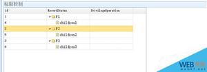
效果图:
<!DOCTYPE html>
<html>
<head>
<meta charset="UTF-8">
<title>Basic Accordion - jQuery EasyUI Demo</title>
<link rel="stylesheet" type="text/css" href="../themes/default/easyui.css">
<link rel="stylesheet" type="text/css" href="../themes/icon.css">
<link rel="stylesheet" type="text/css" href="demo.css">
<script type="text/javascript" src="../jquery.min.js"></script>
<script type="text/javascript" src="../jquery.easyui.min.js"></script>
</head>
<body>
<h2>Basic Accordion</h2>
<p>单击面板头部显示内容.</p>
<div style="margin:20px 0 10px 0;"></div>
<div class="easyui-accordion" style="width:500px;height:300px;">
<div title="About" data-options="iconCls:'icon-ok'" style="overflow:auto;padding:10px;">
<h3 style="color:#0099FF;">手风琴</h3>
<p>手风琴组件.</p>
</div>
<div title="Help" data-options="iconCls:'icon-help'" style="padding:10px;">
<p>The accordion allows you to provide multiple panels and display one or more at a time. Each panel has built-in support for expanding and collapsing. Clicking on a panel header to expand or collapse that panel body. The panel content can be loaded via ajax by specifying a 'href' property. Users can define a panel to be selected. If it is not specified, then the first panel is taken by default.</p>
</div>
<div title="菜单" data-options="iconCls:'icon-search'" style="padding:10px;">
<ul class="easyui-tree">
<li>
<span>食物</span>
<ul>
<li>
<span>水果</span>
<ul>
<li>苹果</li>
<li>橙子</li>
</ul>
</li>
<li>
<span>蔬菜</span>
<ul>
<li>西红柿</li>
<li>胡萝卜</li>
<li>洋白菜</li>
<li>土豆</li>
<li>莴苣</li>
</ul>
</li>
</ul>
</li>
</ul>
</div>
</div>
</body>
</html>
以上是 Jquery组件easyUi实现手风琴(折叠面板)示例 的全部内容, 来源链接: utcz.com/z/325375.html