c# WPF中CheckBox样式的使用总结
背景
很多时候我们使用WPF开发界面的时候经常会用到各种空间,很多时候我们需要去自定义控件的样式来替换默认的样式,今天通过两个方法来替换WPF中的CheckBox样式,透过这两个例子我们可以掌握基本的WPF样式的开发如何定义ControlTemplate以及使用附加属性来为我们的控件增加新的样式。
常规使用
我们在使用CheckBox的时候,原始的样式有时不能满足我们的需求,这是我们就需要更改其模板,比如我们常用的一种,在播放器中“播放”、“暂停”按钮,其实这也是一种CheckBox,只不过我们只是修改了其相关的模板罢了,下面贴出相关代码:
<CheckBox.Style>
<Style TargetType="{x:Type CheckBox}">
<Setter Property="Focusable" Value="False" />
<Setter Property="IsTabStop" Value="False" />
<!--把OverridesDefaultStyle设置为True,表示这个控件不使用当前Themes的任何属性。-->
<Setter Property="OverridesDefaultStyle" Value="True" />
<Style.Triggers>
<Trigger Property="IsChecked" Value="True">
<Setter Property="Template">
<Setter.Value>
<ControlTemplate TargetType="{x:Type CheckBox}">
<Grid Background="Transparent">
<Image Source="/EarthSimulation;component/Images/按钮-播放.png"/>
</Grid>
</ControlTemplate>
</Setter.Value>
</Setter>
</Trigger>
<Trigger Property="IsChecked" Value="False">
<Setter Property="Template">
<Setter.Value>
<ControlTemplate TargetType="{x:Type CheckBox}">
<Grid Background="Transparent">
<Image Source="/EarthSimulation;component/Images/按钮-暂停.png"/>
</Grid>
</ControlTemplate>
</Setter.Value>
</Setter>
</Trigger>
</Style.Triggers>
</Style>
</CheckBox.Style>
</CheckBox>
进阶用法
上面的使用较为简单,下面我们通过一个更加复杂一些的例子来增加对自定义控件模板的理解,我们先来看看我们定义的样式。
<Style x:Key="CheckBoxStyle" TargetType="{x:Type CheckBox}">
<Setter Property="FocusVisualStyle" Value="{x:Null}"/>
<Setter Property="Background" Value="Transparent"/>
<Setter Property="BorderBrush" Value="Transparent"/>
<Setter Property="Foreground" Value="{DynamicResource {x:Static SystemColors.ControlTextBrushKey}}"/>
<Setter Property="Template">
<Setter.Value>
<ControlTemplate TargetType="{x:Type CheckBox}">
<Border x:Name="templateRoot" Background="{TemplateBinding Background}" >
<Grid SnapsToDevicePixels="True">
<Grid.Resources>
<PathGeometry x:Key="geometryCheck" Figures="M540.5696 102.4c-225.83296 0-409.6 183.74656-409.6 409.6s183.76704 409.6 409.6 409.6c225.87392 0 409.6-183.74656 409.6-409.6S766.44352 102.4 540.5696 102.4zM721.16224 468.48l-175.37024 175.39072c-12.20608 12.1856-28.20096 18.28864-44.19584 18.28864-15.95392 0-31.96928-6.10304-44.15488-18.28864l-97.44384-97.44384c-24.39168-24.39168-24.39168-63.93856 0-88.33024 24.39168-24.41216 63.91808-24.41216 88.35072 0l53.248 53.248 131.23584-131.21536c24.35072-24.3712 63.95904-24.3712 88.33024 0C745.55392 404.52096 745.55392 444.08832 721.16224 468.48z"/>
</Grid.Resources>
<Grid.ColumnDefinitions>
<ColumnDefinition Width="20"/>
<ColumnDefinition Width="*"/>
<ColumnDefinition Width="30"/>
</Grid.ColumnDefinitions>
<Border>
<Path Width="18" Height="18" Stretch="Uniform"
Data="{Binding (local_ctrl:GeometryAP.IconGeometry), RelativeSource={RelativeSource Mode=FindAncestor,AncestorType={x:Type CheckBox}}}"
Fill="{Binding (local_ctrl:GeometryAP.IconFill), RelativeSource={RelativeSource Mode=FindAncestor,AncestorType={x:Type CheckBox}}}"/>
</Border>
<ContentPresenter x:Name="contentPresenter" Grid.Column="1" Focusable="False"
Margin="{TemplateBinding Padding}"
RecognizesAccessKey="True"
SnapsToDevicePixels="{TemplateBinding SnapsToDevicePixels}"
HorizontalAlignment="Left"
VerticalAlignment="Center"/>
<Border x:Name="checkBoxBorder"
Grid.Column="2"
Margin="1"
BorderBrush="Transparent"
BorderThickness="1"
Background="Transparent"
HorizontalAlignment="Left"
VerticalAlignment="Center">
<Grid x:Name="markGrid">
<Path x:Name="optionMark" Width="20" Height="20"
Stretch="Uniform"
Data="{StaticResource geometryCheck}"
Fill="LightSeaGreen" Margin="1" Opacity="0"/>
</Grid>
</Border>
</Grid>
</Border>
<ControlTemplate.Triggers>
<Trigger Property="HasContent" Value="true">
<Setter Property="Padding" Value="4,-1,0,0"/>
</Trigger>
<Trigger Property="IsMouseOver" Value="true">
<Setter Property="Cursor" Value="Hand"/>
<Setter Property="Background" Value="#22222222"/>
</Trigger>
<Trigger Property="IsEnabled" Value="false">
<Setter Property="Opacity" Value=".3"/>
</Trigger>
<Trigger Property="IsPressed" Value="true">
<Setter Property="Cursor" Value="Hand"/>
<Setter Property="Background" Value="#22333333"/>
</Trigger>
<Trigger Property="IsChecked" Value="true">
<Setter Property="Opacity" TargetName="optionMark" Value="1"/>
</Trigger>
</ControlTemplate.Triggers>
</ControlTemplate>
</Setter.Value>
</Setter>
</Style>
后面我们再来看看,我们使用CheckBox的地方。
<CheckBox Grid.Row="1" Grid.Column="1"
IsChecked="{Binding VM.IsHorizontal,ElementName=_this}" Content="Horizontal"
Style="{StaticResource CheckBoxStyle}"
local_ctrl:GeometryAP.IconGeometry="{StaticResource geometryDirection}"
local_ctrl:GeometryAP.IconFill="LightSeaGreen"/>
这个地方我们为CheckBox增加了两个附加属性IconGeometry、IconFill这样我们就能够将这两个附加属性绑定到CheckBox样式中的Path里面的Data和Fill依赖项属性上面,通过上面的过程我们就能够定义各种各样的CheckBox样式了,下面我们看看我们定义的这两个附加属性具体的代码。
public class GeometryAP : DependencyObject
{
public static PathGeometry GetIconGeometry(DependencyObject obj)
{
return (PathGeometry)obj.GetValue(IconGeometryProperty);
}
public static void SetIconGeometry(DependencyObject obj, PathGeometry value)
{
obj.SetValue(IconGeometryProperty, value);
}
public static Brush GetIconFill(DependencyObject obj)
{
return (Brush)obj.GetValue(IconFillProperty);
}
public static void SetIconFill(DependencyObject obj, Brush brush)
{
obj.SetValue(IconFillProperty, brush);
}
public static readonly DependencyProperty IconGeometryProperty = DependencyProperty.RegisterAttached("IconGeometry", typeof(PathGeometry), typeof(GeometryAP));
public static readonly DependencyProperty IconFillProperty = DependencyProperty.RegisterAttached("IconFill", typeof(Brush), typeof(GeometryAP), new PropertyMetadata(Brushes.Transparent));
}
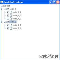
样式欣赏
以上是 c# WPF中CheckBox样式的使用总结 的全部内容, 来源链接: utcz.com/z/311532.html