从数列与百分比的饼图创建为标签
我创建了一个清单,1列的值的计数:从数列与百分比的饼图创建为标签
ataques_tot <- count(t1$attacktype1_txt) ataques_tot
x freq
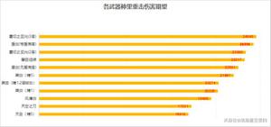
1 Armed Assault 40223
2 Assassination 18402
3 Bombing/Explosion 83073
4 Facility/Infrastructure Attack 9581
5 Hijacking 11733
6 Unarmed Assault 913
7 Unknown 6425
我想打一个饼图与百分比,不与计数出来了。我试图把该列表的DF,然后使用这样的事情:
ggpie(ataques_tot, "value", label = "group", fill = "group", color = "white")
但我很努力了很多,也许这个选项已经在实施GGPLOT2 ...
我已经试过也这个:
pie <- ggplot(t1, aes(x = factor(1), fill = factor(attacktype1_txt))) + geom_bar(width = 1)
pie + coord_polar(theta = "y")
但它给了我一个计数,而不是分类变量的百分比。之后,我只需要赋予剧情权利,就是这样。
回答:
计算百分比:
d$perc <- round(100 * d$freq/sum(d$freq)) 然后剧情:
ggplot(data = d, aes(x = 0, y = freq, fill = x)) + geom_bar(stat = "identity") +
geom_text(aes(label = perc), position = position_stack(vjust = 0.5)) +
scale_x_continuous(expand = c(0,0)) +
labs(fill = 'Type', x = NULL, y = NULL, title = 'Deaths', subtitle = 'in perventages') +
coord_polar(theta = "y") +
theme_minimal()
这给:
使用的数据:
d <- structure(list(x = c("Armed Assault", "Assassination", "Bombing/Explosion", "Facility/Infrastructure Attack", "Hijacking", "Unarmed Assault", "Unknown"), freq = c(40223L, 18402L, 83073L, 9581L, 11733L, 913L, 6425L)),
.Names = c("x", "freq"), class = "data.frame", row.names = c(NA, -7L))
以上是 从数列与百分比的饼图创建为标签 的全部内容, 来源链接: utcz.com/qa/267278.html