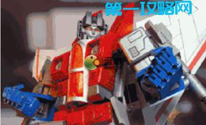
CSS 怎么实现这样的轮播图效果?
像是一个圆形环绕一样,但是要是轮播图的效果,有没有遇到过这种需求,求一份demo或者解决思路,我主要是做后端开发,前端比较菜。。
回答:
<html> <head>
<title>option chain</title>
<meta charset="utf-8" />
<style>
* {
padding: 0;
margin: 0;
box-sizing: border-box;
}
div{
height: 50px;
aspect-ratio: 1;
line-height: 50px;
text-align: center;
border: 1px solid red;
transform: rotate(var(--rotate)) translateX(100px);
position: absolute;
top: 400px;
left: 400px;
}
div:nth-of-type(1) {
--rotate: -50deg;
}
div:nth-of-type(2) {
--rotate: -80deg;
}
div:nth-of-type(3) {
--rotate: -110deg;
}
div:nth-of-type(4) {
--rotate: -140deg;
}
</style>
</head>
<body>
<div>1</div>
<div>2</div>
<div>3</div>
<div>4</div>
</body>
</html>
类似这样?
以上是 CSS 怎么实现这样的轮播图效果? 的全部内容, 来源链接: utcz.com/p/935480.html