使用 SASS 来写一个三角的 Mixins
三角 Mixin 的思路主要来自于 CSS 制作三角工具中。我们先来看一张截图:
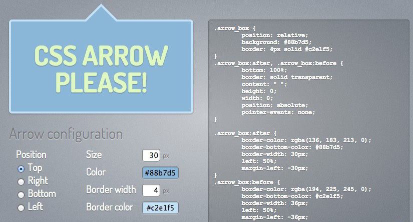
从上图中,可以看出,整个工具中提供了五个参数给我们做选择:
- 位置:也就是三角的方向,主要包括向上
top,向右right,向下bottom和向左left; - 大小:主要用来设置三角形大小;
- 颜色:主要用来设置三角颜色
- 边框宽度:这个是用来实现带有边框的三角效果
- 边框颜色:用来设置带有边框的三角的边框色
而整个实现原理使用上border来制作三角,至于如何用border制作三角,大家请参阅文章开头所列的相关教程。这里需要特别注意的一点:上图使用的是CSS3的伪元素:before和:after来控制三角部分。当你的三角是纯色(也就是说不带边框的三角效果),那么可以只使用一个伪类;当你的三角带有边框,那么需要两个伪类都同时应用。由于IE低版本不支持伪类的使用,你需要在元素内添加两个标签来代替伪类。
回到SASS中,我们要定义一个mixin,也应该围绕工具上所展示的几个参数来做思考。将工具中所列的选项做为一个参数传入进去。例如,我们将三角的mixin命名为:triangle,根据上面所述,需要制作三角需要的参数:大小$size,颜色$color,位置(方向)$direction,边框大小$borderSize和边框颜色$borderColor。那么我们能这样定义吗?或者说,在@mixin triangle中需要定义这么多参数吗?大家先别急于去回答,把这个问题的答案放到最后来回答,暂时你只要心中有这样的概念存在就可以了。
典型的SASS Triangle Mixin
使用SASS定制 @mixin triangle,我想在网上应该会有成熟的实现方法,于是打开 http://www.google.com 输入关键词 sass triangle mixin,还真是找出一大片。打开了一些相关链接,经过一段阅读后,我筛选了几个经典的案例,接下来,我们来看看这几个经典的用例。
Bourbon的Triangle Mixin
Bourbon 是一个优秀的SASS库,里面涵盖了很多个经典的 Mixins,其中就有一个关于三角形的 Mixin——triangle。Bourbon 使用的方法就是CSS中很简单的一种,通过 border 技巧来制作三角。我们先来看看其实现三角的Mixin是怎么写的:
@mixin triangle ($size, $color, $direction) { height: 0;
width: 0;
//三角向上、向下、向右和向左时,设置边框样式
@if ($direction == up) or ($direction == down) or ($direction == right) or ($direction == left) {
border-color: transparent;
border-style: solid;
border-width: $size / 2;
//三角向上时,底部边框颜色为$color
@if $direction == up {
border-bottom-color: $color;
//三角向右时,左边边框颜色为$color
} @else if $direction == right {
border-left-color: $color;
//三你向下时,顶部边框颜色为$color
} @else if $direction == down {
border-top-color: $color;
//三角向左时,右边框颜色为$color
} @else if $direction == left {
border-right-color: $color;
}
}
//当三角为左上、右上直角三角形时
@else if ($direction == up-right) or ($direction == up-left) {
border-top: $size solid $color;//顶边边框样式
//当三角为右上直角三角形时,设置左边边框为透明
@if $direction == up-right {
border-left: $size solid transparent;
//当三角为左上直角三角形时,设置右边边框为透明
} @else if $direction == up-left {
border-right: $size solid transparent;
}
}
//当三角为右下、左下直角三角形时
@else if ($direction == down-right) or ($direction == down-left) {
border-bottom: $size solid $color;//底边边框样式
//当三角为右下直角三角形时,设置左边边框为透明
@if $direction == down-right {
border-left: $size solid transparent;
//当三你为左下直角三角形时,设置右边边框为透明
} @else if $direction == down-left {
border-right: $size solid transparent;
}
}
}
在 Bourbon 中,给@mixin triangle传递了三个参数:$size、$color和$direction,分别用来控制三角的大小、颜色和位置(方向)。并且根据三角的形状将三角分为两大类,其中一类就是类似于等边三角形的,另外一种就是直角三角形。当然后者这种三角在实际应用中并不太常见,但有时也是需要使用的,比如说制作 Ribbon 会使用其制作折边效果。
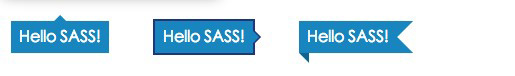
如果要在实际中使用这个 triangle,我们需要配合伪类:before和:after或者通过添加标签。我们来看一个简单的实例。
//HTML结构<div class="tooltip">Hello SASS!</div>
<div class="tooltip-border">Hello SASS!</div>
<div class="ribbons">Hello SASS!</div>
直接将 Bourbon 的 trangle 拿来使用。在这里我们不考虑IE下的兼容,所以在示例中采用:before和:after实现。
//声明变量$bgColor: #0186ba; //设置背景色
$color: #fff; //设置文本色
$font-size: 16px; //设置字号
$unit: 4px; //设置长度变量
$borderColor: #223678; //设置边框色
//因为三个div将使用相同的基本样式,所以使用`%placeholders`将公用样式抽出
%boxStyle {
display: inline-block;
margin: $unit * 5;
padding: $unit * 2;
background: $bgColor;
color: $color;
position: relative;//设置相对定位,做为三角定位的参考物
}
//伪类要起作用,必须要使用`content:""`
%content {
content:"";
display: block;
position: absolute;
}
//示例一:纯色的tooltip效果,三角向上
.tooltip {
@extend %boxStyle;
&:before {
@include triangle(($unit * 3), $bgColor, up);
@extend %content;
//给三角定位
bottom: 100%;
left: 50%;
margin-left: -($unit * 3) / 2;
}
}
//示例二:带有边框的tooltip效果,三角向右
.tooltip-border {
@extend %boxStyle;
border: 2px solid $borderColor;//给元素自身添加一个border
//给伪类添加样式
&:before,
&:after{
@extend %content;
}
//上面的三角,注意颜色和背景色相同
&:before {
@include triangle(12px,$bgColor,right);
left: 100%;
z-index: 2;
top: 10px;
}
//底下的三角,注意颜色和前景色相同
&:after {
@include triangle(16px,$borderColor,right);
left: 100%;
top: 8px;
z-index: 1;
}
}
//制作ribbon
.ribbons {
@extend %boxStyle;//定义容器基本样式
padding-right: $unit * 6;//增加右边内距
//设置伪类的基本样式
&:before,
&:after {
@extend %content;
}
//制作ribbon右边三角效果,注意颜色为白色
&:after {
@include triangle(32px,#fff,left);
right: 0;
top: 0;
}
//通过`up-right`制作右下角三角,并且颜色在`$bgColor`基础上加深9%,实现左边折角效果
&:before {
@include triangle(10px, darken($bgColor, 9%), up-right);
left: 0;
top: 100%
}
}
转出的CSS
.tooltip, .tooltip-border,
.ribbons {
display: inline-block;
margin: 20px;
padding: 8px;
background: #0186ba;
color: white;
position: relative;
}
.tooltip:before,
.tooltip-border:before,
.tooltip-border:after,
.ribbons:before,
.ribbons:after {
content: "";
display: block;
position: absolute;
}
.tooltip:before {
height: 0;
width: 0;
border-color: transparent;
border-style: solid;
border-width: 6px;
border-bottom-color: #0186ba;
bottom: 100%;
left: 50%;
margin-left: -6px;
}
.tooltip-border {
border: 2px solid #223678;
}
.tooltip-border:before {
height: 0;
width: 0;
border-color: transparent;
border-style: solid;
border-width: 6px;
border-left-color: #0186ba;
left: 100%;
z-index: 2;
top: 10px;
}
.tooltip-border:after {
height: 0;
width: 0;
border-color: transparent;
border-style: solid;
border-width: 8px;
border-left-color: #223678;
left: 100%;
top: 8px;
z-index: 1;
}
.ribbons {
padding-right: 24px;
}
.ribbons:after {
height: 0;
width: 0;
border-color: transparent;
border-style: solid;
border-width: 16px;
border-right-color: white;
right: 0;
top: 0;
}
.ribbons:before {
height: 0;
width: 0;
border-top: 10px solid #01658c;
border-left: 10px solid transparent;
left: 0;
top: 100%;
}
效果出来了,基本上满足了大家制作三角的需求,但细看编译出来的CSS代码还是有很多相同的没有合并起来,这对于有代码洁癖的同学来说,是件很讨厌的事情。这也是SASS不被很多同学喜欢的原因之一。其实出现这个现象,并不是SASS惹的祸,而是我们自己人为造成的,此处咱暂且搁置不管。
另外,有一点需要大家注意的是如果你的效果要支持IE低版本,我们的结构是要做一点的调整的。在容器内添加一个或两个空标签,同时用类名来替代伪类。
//HTML结构<div class="tooltip">
<span class="triangle"></span>Hello SASS!
</div>
<div class="tooltip-border">
<span class="triangle"></span>
<span class="triangle-border"></span>Hello SASS!
</div>
<div class="ribbons">
<span class="triangle-up-right"></span>
<span class="triangle-left"></span>Hello SASS!
</div>
- 优点:实现在常见的三角效果。可以根据所需调用。
- 缺点:没有合并相同的代码,并且方向定位没有考虑进来。
sassCore 的 Triangle Mixin
在 sassCore 中的 Mixins 中同样为三角定义了一个@mixin triangle。在这个triangle中只定义了常见的四种三角,也就是向上top,向右right,向下bottom和向左left。与Bourbon的@mixin triangle相比,少了另外四种风格。相对而言要简单一点,但功能也就少了一点。
sassCore中的triangle和Bourbon中的triangle一样,给@mixin triangle设置了三个参数:方向$direction,大小$size和颜色$borderColor。而且他们实现原理都是一样的,使用border来制作三角:
@mixin triangle($direction, $size, $borderColor ) { content:"";
height: 0;
width: 0;
@if $direction == top {
border-bottom:$size solid $borderColor;
border-left:$size dashed transparent;
border-right:$size dashed transparent;
}
@else if $direction == right {
border-left:$size solid $borderColor;
border-top:$size dashed transparent;
border-bottom:$size dashed transparent;
}
@else if $direction == bottom {
border-top:$size solid $borderColor;
border-left:$size dashed transparent;
border-right:$size dashed transparent;
}
@else if $direction == left {
border-right:$size solid $borderColor;
border-top:$size dashed transparent;
border-bottom:$size dashed transparent;
}
}
使用方法和Bourbon一样,需要先在元素中定义一个相对定位relative做为参考物,然后通过伪元素:after和:before或者空标签(如span)使用@include triangle调用,同时需要在里面设置绝对定位absolute。根据自己的位置所需,定义top,right,bottom和left的值。
接下来,使用sassCore的triangle来制作一个Ribbon效果:
<div class="ribbon">Hello SASS!</div>实现效果所用的SCSS:
//定义变量$bgColor: hsla(100,80%,20%,0.6);//定义背景色
$color: #fff;//定义文本色
$unit: 30px; //定义长度值
.ribbon {
//Ribbon基本样式
background-color: $bgColor;
padding-left: $unit;
height: $unit;
line-height: $unit;
width: $unit * 10;
margin: ($unit / 3) auto;
color: $color;
position: relative;
//实现Ribbon右边与背景色相同的三角
&:after {
@include triangle(right,($unit / 2),$bgColor);//调用与背景相同的颜色
position: absolute;
top: 0;
left: 100%;
}
//实现Ribbon左边镂空的三角
&:before {
@include triangle(right,($unit / 2),$color);//调用与Ribbon容器相的背景色,这里默认为白色
position: absolute;
top: 0;
left: 0;
}
}
编译出来的CSS
.ribbon { background-color: rgba(37, 92, 10, 0.6);
padding-left: 30px;
height: 30px;
line-height: 30px;
width: 300px;
margin: 10px auto;
color: white;
position: relative;
}
.ribbon:after {
content: "";
height: 0;
width: 0;
border-left: 15px solid rgba(37, 92, 10, 0.6);
border-top: 15px dashed transparent;
border-bottom: 15px dashed transparent;
position: absolute;
top: 0;
left: 100%;
}
.ribbon:before {
content: "";
height: 0;
width: 0;
border-left: 15px solid white;
border-top: 15px dashed transparent;
border-bottom: 15px dashed transparent;
position: absolute;
top: 0;
left: 0;
}

- 优点:简单明了,易用。
- 缺点:生成多余代码,缺少其他三角功能。
Miguelmota 的 Triangle Mixin
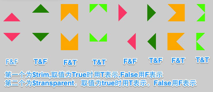
Miguel Mota在他的Blog中发表了一篇有关于SASS写的triangle——《Sass Triangles》。这篇文章介绍的triangle制作有其独到的地方(我个人认为)。——他可以通过mixin来控制三角是不是透明,是否内嵌在元素内。
Miguolmotal的triangle和前面介绍的两个triangle在参数定义之时就有明显的区别。除了定义了$size,$color,direction三个参数之外还追加了另外两个参数$trim和$transparent布尔值,用来判断三角是否截取一边的宽度(也就是其中一个方向的border宽度为0),是否透明。我们一起来看其定义的triangle代码:
@mixin triangle($size:24px, $color:#000, $direction:up, $trim:false, $transparent:false) { content: "";
display: inline-block;
width: 0;
height: 0;
border: solid $size;
@if $direction == up {
border-color: transparent transparent $color transparent;
@if $transparent {
border-color: $color $color transparent $color;
}
@if $trim {
border-top-width: 0;
}
}
@if $direction == right {
border-color: transparent transparent transparent $color;
@if $transparent {
border-color: $color $color $color transparent ;
}
@if $trim {
border-right-width: 0;
}
}
@if $direction == down {
border-color: $color transparent transparent transparent;
@if $transparent {
border-color: transparent $color $color $color;
}
@if $trim {
border-bottom-width: 0;
}
}
@if $direction == left {
border-color: transparent $color transparent transparent;
@if $transparent {
border-color: $color transparent $color $color;
}
@if $trim {
border-left-width: 0;
}
}
}
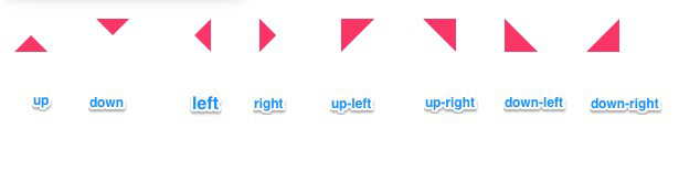
在这个triangle,每一个方向,都会用四种情形出现,也就是$trim和$transparent分别为true和false的排列组合:
//三角向上<div class="up"></div> //$trim=false,$transparent=false
<div class="up-trim"></div> //$trim=true,$transparent=false
<div class="up-transparent"></div> //$trim=false,$transparent=true
<div class="up-trim-transparent"></div> //$trim=true,$transparent=true
//三角向右
<div class="right"></div>
<div class="right-trim"></div>
<div class="right-transparent"></div>
<div class="right-trim-transparent"></div>
//三角向下
<div class="down"></div>
<div class="down-trim"></div>
<div class="down-transparent"></div>
<div class="down-trim-transparent"></div>
//三角向左
<div class="left"></div>
<div class="left-trim"></div>
<div class="left-transparent"></div>
<div class="left-trim-transparent"></div>
使用方法
.up { @include triangle(30px,#f36,up,false,false);
}
.up-trim {
@include triangle(30px,green,up,true,false);
}
.up-transparent {
@include triangle(30px,orange,up,false,true);
}
.up-trim-transparent {
@include triangle(30px,lime,up,true,true);
}
.right {
@include triangle(30px,#f36,right,false,false);
}
.right-trim {
@include triangle(30px,green,right,true,false);
}
.right-transparent {
@include triangle(30px,orange,right,false,true);
}
.right-trim-transparent {
@include triangle(30px,lime,right,true,true);
}
.down {
@include triangle(30px,#f36,down,false,false);
}
.down-trim {
@include triangle(30px,green,down,true,false);
}
.down-transparent {
@include triangle(30px,orange,down,false,true);
}
.down-trim-transparent{
@include triangle(30px,lime,down,true,true);
}
.left {
@include triangle(30px,#f36,left,false,false);
}
.left-trim {
@include triangle(30px,green,left,true,false);
}
.left-transparent {
@include triangle(30px,orange,left,false,true);
}
.left-trim-transparent{
@include triangle(30px,lime,left,true,true);
}
生成的三角,每个方向都会有四种:
这个triangle最大的功能就是在传参数时,设置了两下值$trim和$transparent用来判断三角为外凸还是内嵌。这种方法用来实现彩带效果会非常方便。当然有时为了实现三角透明,看到背景,功能就很方便了。Miguel Mota在他的Blog中就使用了三角透明的效果,不过实现这个效果可不只是轻意的说其中一边为透明简单,他还要配合其他的CSS样式才可以完美的实现,感兴趣的同学不仿看看:
- 优点:功能方便,可以根据所需设置三角方式(内嵌还是外凸)
- 缺点:代码更为复杂,生成多余代码,缺少定位
思考与改变
经过前面三个优秀的triangle学习,大家都对Sass实现三角的mixin有所了解,而且每种方法都有其其同的特点,不管是好的方面还是不足之处。好的咱就不说了,来看看他们一起共有的不足之处:
- 生成多余的代码(使用伪类所需的
content,甚至还有重置width,height为0); - 缺少定位(在实际运用中,三角就是四个方向,在
mixin没有体现出定位功能) - 三角形状未能集全(各自有自己特点,未把所有三角形状集合在一起)
看到上面的归纳,大家有没有尝试去改变他们,或者说将其三者的优势集为一身。如果没有,我觉得那我们的学习也就是一个依葫芦画瓢,提高并不会很高。要是你有想过,你会怎么来改变呢?下面说说我自己的思考:
- 将所有三角形状合并到一起
- 增加定位功能
- 合并伪类所需代码
有了方向就好办,我将朝这三个方向去改变。
W3cplus 的 Triangle Mixin
我把自己整的三角triangle命名为 W3cplus triangle,不为别的,只是为了能与前面三前方法有所区别。如果你感兴趣,那么我们一起来动手一试试吧。
先说说我考虑的思路:
- 制作原理同样使用
border制作三角,为了配合伪类使用,先定义一个%content; - 增加定位功能,并且通过开关
$inner实现三角是否内嵌到元素内; - 新增一个背景色参数
$bgColor,主要有两方面的作用,第一实现内嵌三角的颜色,另外实现边框三角颜色; - 集成
$transparent开关,实现透明三角功能; - 集成了边角三角的形状。
知道功能之后,我们开始来实现这些功能的mixin:
// 定义 @mixin content@mixin content{
content: "";
display: block;
width: 0;
height: 0;
}
//定义%content
%content {
@include content;
}
//----------------------------------------
// 定义 @mixin trangile
//----------------------------------------
//1. $size定义三角大小 默认参数值30px
//2. $color定义三角颜色 默认参数值#000
//3. $bgColor定义内嵌三角颜色 默认参数值#111
//4. $direction定义三角方向 默认参数值up
//5. $inner定义三角是否内嵌 默认参数值false,表示不内嵌
//6. $transparent定义透明三角 默认参数值false,表示三角不透明
@mixin triangle ($size:30px,$color:#000,$bgColor:#111,$direction:up,$inner:false,$transparent:false){
//使用border制作三角,有可能使用伪类生成,需要调用一个伪类所需样式
@extend %content;
position: absolute; //其父元素需要定义为position:realtive
//判断三角形状
//三角形为向上up、向右right、向下down和向左left四种
@if ($direction == up) or ($direction == right) or ($direction == down) or ($direction == left) {
//设置边框
border: ($size / 2) solid transparent;
//三角朝上
@if $direction == up {
//三角内嵌 $inner=true
@if $inner {
border-color: $bgColor transparent transparent transparent;
border-bottom-width: 0;
top: 0;
} @else { //三角为内嵌$inner=false
border-color: transparent transparent $color transparent;
border-top-width: 0;
bottom: 100%;
}
//三角为透明 $transparent = true
@if $transparent {
border-color: transparent $color $color $color;
border-top-width: $size / 2;
border-bottom-width: 0;
}
}
//三角朝右
@else if $direction == right {
@if $inner {
border-color: transparent $bgColor transparent transparent;
border-left-width: 0;
right: 0;
} @else {
border-color: transparent transparent transparent $color;
border-right-width: 0;
left: 100%;
}
@if $transparent {
border-color: $color transparent $color $color;
border-right-width: $size / 2;
border-left-width: 0;
}
}
//三角朝下
@else if $direction == down {
@if $inner {
border-color: transparent transparent $bgColor transparent;
border-top-width: 0;
bottom: 0;
} @else {
border-color: $color transparent transparent transparent;
border-bottom-width: 0;
top: 100%;
}
@if $transparent {
border-color: $color $color transparent $color;
border-bottom-width: $size / 2;
border-top-width: 0;
}
}
//三角朝右
@else if $direction == left {
@if $inner {
border-color: transparent transparent transparent $bgColor;
border-right-width: 0;
left: 0;
} @else {
border-color: transparent $color transparent transparent;
border-left-width: 0;
right: 100%;
}
@if $transparent {
border-color: $color $color $color transparent;
border-left-width: $size / 2;
border-right-width: 0;
}
}
}
//当三角为左上、右上直角三角形时
@else if ($direction == up-right) or ($direction == up-left) {
border-top: $size solid $color;//顶边边框样式
top: 100%;
//当三角为右上直角三角形时,设置左边边框为透明
@if $direction == up-right {
border-left: $size solid transparent;
left: 0;
//当三角为左上直角三角形时,设置右边边框为透明
} @else if $direction == up-left {
border-right: $size solid transparent;
right:0;
}
}
//当三角为右下、左下直角三角形时
@else if ($direction == down-right) or ($direction == down-left) {
border-bottom: $size solid $color;//底边边框样式
bottom: 100%;
//当三角为右下直角三角形时,设置左边边框为透明
@if $direction == down-right {
border-left: $size solid transparent;
left: 0;
//当三你为左下直角三角形时,设置右边边框为透明
} @else if $direction == down-left {
border-right: $size solid transparent;
right: 0;
}
}
}
如此看来定义的@mixin triangle从代码层面上复杂的多了,但在实际使用,也非常的简单:
.tooltip { &:before {
@include triangle(30px,#ccc,#f36,up,false,false);
}
}
对于$inner和$transparent开关设置,我们总共有三组排列:
$inner = false和$transparent= false三角不内嵌$inner = true和$transparent = false三角内嵌元素中$inner = false和$transparent = true三角不内嵌,而且为透明三角$inner = true和$transparent = true不存在,没有做处理。切记调用时不能同时为true,否则将无效果显示。
另外在up-left,up-right,down-left和down-right三角中,未开启内嵌和透明功能,所以在调用之时,$inner和$transparent将永远处于false状态。
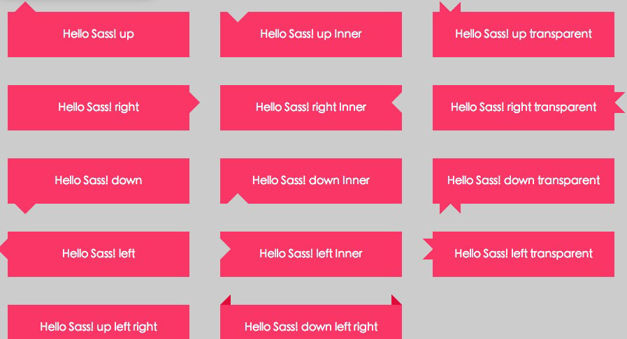
我们一起来领略一下这几种情形的效果:
<div class="wrap up">Hello Sass! up</div><div class="wrap up-inner">Hello Sass! up Inner</div>
<div class="wrap up-transparent">Hello Sass! up transparent</div>
<div class="wrap right">Hello Sass! right</div>
<div class="wrap right-inner">Hello Sass! right Inner</div>
<div class="wrap right-transparent">Hello Sass! right transparent</div>
<div class="wrap down">Hello Sass! down</div>
<div class="wrap down-inner">Hello Sass! down Inner</div>
<div class="wrap down-transparent">Hello Sass! down transparent</div>
<div class="wrap left">Hello Sass! left</div>
<div class="wrap left-inner">Hello Sass! left Inner</div>
<div class="wrap left-transparent">Hello Sass! left transparent</div>
<div class="wrap up-left-right">Hello Sass! up left right</div>
<div class="wrap down-left-right">Hello Sass! down left right</div>
调用Sass代码:
//设置元素基本变量 $bgColor: #f36;
$color: #fff;
$borderColor: #ded;
$unit: 30px;
//基本样式
body {
background: #ccc;
}
.wrap {
display: inline-block;
background: $bgColor;
margin: $unit;
padding: $unit / 3;
width: $unit * 8;
height: $unit * 1.5;
line-height: $unit * 1.5;
color: $color;
text-align: center;
position: relative;
}
//调用`@mixin triangle`
.up {
&:before{
@include triangle($unit,$bgColor,$color,up,false,false);
}
}
.up-inner {
&:before {
@include triangle($unit,$bgColor,#ccc,up,true,false);
}
}
.up-transparent {
&:before{
@include triangle($unit,$bgColor,$color,up,false,true);
}
}
.right {
&:before{
@include triangle($unit,$bgColor,$color,right,false,false);
}
}
.right-inner {
&:before {
@include triangle($unit,$bgColor,#ccc,right,true,false);
}
}
.right-transparent {
&:before{
@include triangle($unit,$bgColor,$color,right,false,true);
}
}
.down {
&:before{
@include triangle($unit,$bgColor,$color,down,false,false);
}
}
.down-inner {
&:before {
@include triangle($unit,$bgColor,#ccc,down,true,false);
}
}
.down-transparent {
&:before{
@include triangle($unit,$bgColor,$color,down,false,true);
}
}
.left {
&:before{
@include triangle($unit,$bgColor,$color,left,false,false);
}
}
.left-inner {
&:before {
@include triangle($unit,$bgColor,#ccc,left,true,false);
}
}
.left-transparent {
&:before{
@include triangle($unit,$bgColor,$color,left,false,true);
}
}
.up-left-right {
&:before{
@include triangle(($unit / 2),darken($bgColor,15%),$color,up-left,false,false);
}
&:after{
@include triangle(($unit / 2),darken($bgColor,15%),$color,up-right,false,false);
}
}
.down-left-right {
&:before{
@include triangle(($unit / 2),darken($bgColor,15%),$color,down-left,false,false);
}
&:after{
@include triangle(($unit / 2),darken($bgColor,15%),$color,down-right,false,false);
}
}
编译出来的CSS:
.up:before, .up-inner:before, .up-transparent:before, .right:before, .right-inner:before, .right-transparent:before, .down:before, .down-inner:before, .down-transparent:before, .left:before, .left-inner:before, .left-transparent:before, .up-left-right:before, .up-left-right:after, .down-left-right:before, .down-left-right:after { content: "";
display: block;
width: 0;
height: 0; }
body {
background: #ccc; }
.wrap {
display: inline-block;
background: #ff3366;
margin: 30px;
padding: 10px;
width: 240px;
height: 45px;
line-height: 45px;
color: white;
text-align: center;
position: relative; }
.up:before {
position: absolute;
border: 15px solid transparent;
border-color: transparent transparent #ff3366 transparent;
border-top-width: 0;
bottom: 100%; }
.up-inner:before {
position: absolute;
border: 15px solid transparent;
border-color: #cccccc transparent transparent transparent;
border-bottom-width: 0;
top: 0; }
.up-transparent:before {
position: absolute;
border: 15px solid transparent;
border-color: transparent transparent #ff3366 transparent;
border-top-width: 0;
bottom: 100%;
border-color: transparent #ff3366 #ff3366 #ff3366;
border-top-width: 15px;
border-bottom-width: 0; }
.right:before {
position: absolute;
border: 15px solid transparent;
border-color: transparent transparent transparent #ff3366;
border-right-width: 0;
left: 100%; }
.right-inner:before {
position: absolute;
border: 15px solid transparent;
border-color: transparent #cccccc transparent transparent;
border-left-width: 0;
right: 0; }
.right-transparent:before {
position: absolute;
border: 15px solid transparent;
border-color: transparent transparent transparent #ff3366;
border-right-width: 0;
left: 100%;
border-color: #ff3366 transparent #ff3366 #ff3366;
border-right-width: 15px;
border-left-width: 0; }
.down:before {
position: absolute;
border: 15px solid transparent;
border-color: #ff3366 transparent transparent transparent;
border-bottom-width: 0;
top: 100%; }
.down-inner:before {
position: absolute;
border: 15px solid transparent;
border-color: transparent transparent #cccccc transparent;
border-top-width: 0;
bottom: 0; }
.down-transparent:before {
position: absolute;
border: 15px solid transparent;
border-color: #ff3366 transparent transparent transparent;
border-bottom-width: 0;
top: 100%;
border-color: #ff3366 #ff3366 transparent #ff3366;
border-bottom-width: 15px;
border-top-width: 0; }
.left:before {
position: absolute;
border: 15px solid transparent;
border-color: transparent #ff3366 transparent transparent;
border-left-width: 0;
right: 100%; }
.left-inner:before {
position: absolute;
border: 15px solid transparent;
border-color: transparent transparent transparent #cccccc;
border-right-width: 0;
left: 0; }
.left-transparent:before {
position: absolute;
border: 15px solid transparent;
border-color: transparent #ff3366 transparent transparent;
border-left-width: 0;
right: 100%;
border-color: #ff3366 #ff3366 #ff3366 transparent;
border-left-width: 15px;
border-right-width: 0; }
.up-left-right:before {
position: absolute;
border-top: 15px solid #e60039;
top: 100%;
border-right: 15px solid transparent;
right: 0; }
.up-left-right:after {
position: absolute;
border-top: 15px solid #e60039;
top: 100%;
border-left: 15px solid transparent;
left: 0; }
.down-left-right:before {
position: absolute;
border-bottom: 15px solid #e60039;
bottom: 100%;
border-right: 15px solid transparent;
right: 0; }
.down-left-right:after {
position: absolute;
border-bottom: 15px solid #e60039;
bottom: 100%;
border-left: 15px solid transparent;
left: 0; }
效果如下:
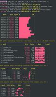
不过上面有一个地方,生成出来的代码不太理想。在开启透明三角的时候,会有重复的代码出现,我们使用firebug查看,一看便知:
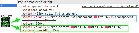
可以说这是一个很不足的地方,虽然实现我们需要的效果,但对于有代码洁癖的同学来说,是无法接受的。我尝试来修复这个问题,但一直受限与定位和三角生成代码重复的取舍。未能找到根本性的解决文案。希望其他的同学,有方法能解决这样的问题。
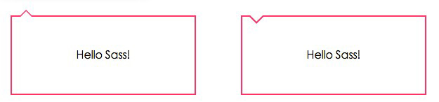
除了上面DEMO展示的效果,我们经常还会碰到只有边框的tooltip效果,正如”CSS Arrow Please”所展示的效果,其实使用这个triangle也可以很轻松的实现。我们一起来看一个简单的实例吧。
<div class="wrap up">Hello Sass!</div><div class="wrap up-inner">Hello Sass!</div>
实现边框的三角,需要使用两个伪类,也就是:after和:before配合使用:
//设置变量$bgColor: #f36;
$color: #fff;
$borderColor: #f36;
$unit: 30px;
.wrap {
display:inline-block;
margin: $unit;
padding: $unit / 3;
width: $unit * 8;
height: $unit * 3;
line-height: $unit * 3;
text-align:center;
border: ($unit / 15) solid $borderColor;
position: relative;
}
.up {
&:after {
@include triangle(20px,$borderColor,$color,up,false,false);
left: 10px;
z-index: 1;
}
&:before {
@include triangle(16px,$color,$color,up,false,false);
left: 12px;
z-index: 2;
}
}
.up-inner {
&:after{
@include triangle(20px,$color,$borderColor,up,true,false);
left: 10px;
z-index: 1;
}
&:before {
@include triangle(18px,$color,$color,up,true,false);
left: 11px;
z-index: 2;
margin-top: -2px;
}
}
编译出来的CSS:
.up:after, .up:before, .up-inner:after, .up-inner:before { content: "";
display: block;
width: 0;
height: 0; }
.wrap {
display: inline-block;
margin: 30px;
padding: 10px;
width: 240px;
height: 90px;
line-height: 90px;
text-align: center;
border: 2px solid #ff3366;
position: relative; }
.up:after {
position: absolute;
border: 10px solid transparent;
border-color: transparent transparent #ff3366 transparent;
border-top-width: 0;
bottom: 100%;
left: 10px;
z-index: 1; }
.up:before {
position: absolute;
border: 8px solid transparent;
border-color: transparent transparent white transparent;
border-top-width: 0;
bottom: 100%;
left: 12px;
z-index: 2; }
.up-inner:after {
position: absolute;
border: 10px solid transparent;
border-color: #ff3366 transparent transparent transparent;
border-bottom-width: 0;
top: 0;
left: 10px;
z-index: 1; }
.up-inner:before {
position: absolute;
border: 9px solid transparent;
border-color: white transparent transparent transparent;
border-bottom-width: 0;
top: 0;
left: 11px;
z-index: 2;
margin-top: -2px; }
当然,如果你要兼容IE低版本,:after和:before是无法帮你实现,此时你需要在元素中添加两个空标签来模仿。
有了这个triangle,可以实现类似于CSS ARROW PLEASE!——@Simon Højberg工具制作三角形状。用于tooltip的样式,不需要碰到一次写一次了,你只需要在需要的时候@include triangle()就OK了。如果你感兴趣的话,不仿将里面的每个Ribbion效果,使用@mixin triangle来实现。期待您的分享。
- 优点:集成众多三角功能,实现默认定位功能
- 缺点:在透明三角处,会增加重复代码。
总结
由在线生成三角工具出发做为思考,结合不同的Sass实现triangle的mixins。最终在Bourbon,sassCore和Migue Lmota三个triangle mixins基础实现一个全新的triangle,在这个triangle集合了众家之处。仅从mixin代码层看,变得复杂化,但在实际使用上和生成三角的代码都无太多差异化。使用这个triangle可以实现tooltip和ribbon等效果。
我在重新思考,实现这个功能,我们是否可以定义一个function呢?如果您有好的想法,希望能一起分享。如果大家对这个三角triangle有不同的看法,欢迎在下面的评论中给我留言。
以上是 使用 SASS 来写一个三角的 Mixins 的全部内容, 来源链接: utcz.com/p/234048.html