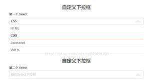
selectize.js 基于 jQuery 的 Select 下拉菜单插件
Selectize.js 是一款基于 jQuery 的操作 <select>、<input> 标签的优秀插件,实现搜索、动态选择、多选、动态数据加载等功能,Selectize 的目标是通过简单而强大的 API 提供坚实可用的用户体验。

使用方法
<script type="text/javascript" src="selectize.js"></script><link rel="stylesheet" type="text/css" href="selectize.css" />
$('#select-beast').selectize({ create: true,
sortField: {
field: 'text',
direction: 'asc'
},
dropdownParent: 'body'
});
IE8 支持
To support Internet Explorer 8, es5-shim must be added your page.
<!--[if lt IE 9]><script src="http://cdnjs.cloudflare.com/ajax/libs/es5-shim/2.0.8/es5-shim.min.js"></script>
<![endif]-->
可选参数
| General | |||||||||||||
|---|---|---|---|---|---|---|---|---|---|---|---|---|---|
| Setting | Description | Type | Default | ||||||||||
options | An array of the initial options available to select; array of objects. By default this is populated from the original input element. If your element is a <select> with <option>s specified this property gets populated automatically. Setting this property is convenient if you have your data as an array and want to automatically generate the <option>s. | array | [] | ||||||||||
items | An array of the initial selected values. By default this is populated from the original input element. | array | [] | ||||||||||
delimiter | The string to separate items by. When typing an item in a multi-selection control allowing creation, then the delimiter, the item is added. If you paste delimiter-separated items in such control, the items are added at once. The delimiter is also used in the getValue API call on a text <input> tag to separate the multiple values. | string | ',' | ||||||||||
create | Allows the user to create new items that aren’t in the initial list of options. This setting can be any of the following: true, false (disabled), or a function to process input. The function can take one of two forms: synchronous (with signature function(input){} or asynchronous (with signature function(input,. In the synchronous case, the function should return an object for the options (eg, with defaults: return { 'value': value, 'text': text). The asynchronous version should invoke the callback with the result in the same format as the object above (eg, callback( { 'value': value, 'text':) | boolean/function | false | ||||||||||
createOnBlur | If true, when user exits the field (clicks outside of input), a new option is created and selected (if create setting is enabled). | boolean | false | ||||||||||
createFilter | Specifies a RegExp or a string containing a regular expression that the current search filter must match to be allowed to be created. May also be a predicate function that takes the filter text and returns whether it is allowed. | RegExp|string|function | null | ||||||||||
highlight | Toggles match highlighting within the dropdown menu. | boolean | true | ||||||||||
persist | If false, items created by the user will not show up as available options once they are unselected. | boolean | true | ||||||||||
openOnFocus | Show the dropdown immediately when the control receives focus. | boolean | true | ||||||||||
maxOptions | The max number of items to render at once in the dropdown list of options. | int | 1000 | ||||||||||
maxItems | The max number of items the user can select. 1 makes the control mono-selection, null allows an unlimited number of items. | int | null | ||||||||||
hideSelected | If true, the items that are currently selected will not be shown in the dropdown list of available options. This defaults to true when in a multi-selection control, to false otherwise. | boolean | null | ||||||||||
closeAfterSelect | If true, the dropdown will be closed after a selection is made. | boolean | false | ||||||||||
allowEmptyOption | If true, Selectize will treat any options with a “” value like normal. This defaults to false to accomodate the common <select> practice of having the first empty option to act as a placeholder. | boolean | false | ||||||||||
scrollDuration | The animation duration (in milliseconds) of the scroll animation triggered when going [up] and [down] in the options dropdown. | int | 60 | ||||||||||
loadThrottle | The number of milliseconds to wait before requesting options from the server or null. If null, throttling is disabled. Useful when loading options dynamically while the user types a search / filter expression. | int | 300 | ||||||||||
loadingClass | The class name added to the wrapper element while awaiting the fulfillment of load requests. | string | 'loading' | ||||||||||
placeholder | The placeholder of the control (displayed when nothing is selected / typed). Defaults to input element’s placeholder, unless this one is specified. | string | undefined | ||||||||||
preload | If true, the load function will be called upon control initialization (with an empty search). Alternatively it can be set to 'focus' to call the load function when control receives focus. | boolean/string | false | ||||||||||
dropdownParent | The element the dropdown menu is appended to. This should be 'body' or null. If null, the dropdown will be appended as a child of the Selectize control. | string | null | ||||||||||
addPrecedence | If true, the “Add…” option is the default selection in the dropdown. | boolean | false | ||||||||||
selectOnTab | If true, the tab key will choose the currently selected item. | boolean | false | ||||||||||
diacritics | Enable or disable international character support. | boolean | true | ||||||||||
| Data / Searching | |||||||||||||
| Setting | Description | Type | Default | ||||||||||
options | See above | array | [] | ||||||||||
optgroups | Option groups that options will be bucketed into. If your element is a <select> with <optgroup>s this property gets populated automatically. Make sure each object in the array has a property named whatever optgroupValueField is set to. | array | [] | ||||||||||
dataAttr | The <option> attribute from which to read JSON data about the option. | string | 'data-data' | ||||||||||
valueField | The name of the property to use as the value when an item is selected. | string | 'value' | ||||||||||
optgroupValueField | The name of the option group property that serves as its unique identifier. | string | 'value' | ||||||||||
labelField | The name of the property to render as an option / item label (not needed when custom rendering functions are defined). | string | 'text' | ||||||||||
optgroupLabelField | The name of the property to render as an option group label (not needed when custom rendering functions are defined). | string | 'label' | ||||||||||
optgroupField | The name of the property to group items by. | string | 'optgroup' | ||||||||||
disabledField | The name of the property to disabled option and optgroup. | string | 'disabled' | ||||||||||
sortField | A single field or an array of fields to sort by. Each item in the array should be an object containing at least a field property. Optionally, direction can be set to 'asc' or 'desc'. The order of the array defines the sort precedence.Unless present, a special `$score` field will be automatically added to the beginning of the sort list. This will make results sorted primarily by match quality (descending). You can override the `$score` function. For more information, see the sifter documentation. | string|array | '$order' | ||||||||||
searchField | An array of property names to analyze when filtering options. | array | ['text'] | ||||||||||
searchConjunction | When searching for multiple terms (separated by space), this is the operator used. Can be 'and' or 'or' . | string | 'and' | ||||||||||
lockOptgroupOrder | If truthy, Selectize will make all optgroups be in the same order as they were added (by the `$order` property). Otherwise, it will order based on the score of the results in each. | boolean | false | ||||||||||
copyClassesToDropdown | Copy the original input classes to the dropdown element. | boolean | true | ||||||||||
| Callbacks | |||||||||||||
| Setting | Description | Type | Default | ||||||||||
load(query, callback) | Invoked when new options should be loaded from the server. Called with the current query string and a callback function to call with the results when they are loaded (or nothing when an error arises). | function | null | ||||||||||
score(search) | Overrides the scoring function used to sort available options. The provided function should return a function that returns a number greater than or equal to zero to represent the score of an item (the function’s first argument). If 0, the option is declared not a match. The search argument is a Search object. For an example, see the “GitHub” example. | function | null | ||||||||||
onInitialize() | Invoked once the control is completely initialized. | function | null | ||||||||||
onFocus() | Invoked when the control gains focus. | function | null | ||||||||||
onBlur() | Invoked when the control loses focus. | function | null | ||||||||||
onChange(value) | Invoked when the value of the control changes. | function | null | ||||||||||
onItemAdd(value, $item) | Invoked when an item is selected. | function | null | ||||||||||
onItemRemove(value) | Invoked when an item is deselected. | function | null | ||||||||||
onClear() | Invoked when the control is manually cleared via the clear() method. | function | null | ||||||||||
onDelete(values) | Invoked when the user attempts to delete the current selection. | function | null | ||||||||||
onOptionAdd(value, data) | Invoked when a new option is added to the available options list. | function | null | ||||||||||
onOptionRemove(value) | Invoked when an option is removed from the available options. | function | null | ||||||||||
onDropdownOpen($dropdown) | Invoked when the dropdown opens. | function | null | ||||||||||
onDropdownClose($dropdown) | Invoked when the dropdown closes. | function | null | ||||||||||
onType(str) | Invoked when the user types while filtering options. | function | null | ||||||||||
onLoad(data) | Invoked when new options have been loaded and added to the control (via the load option or load API method). | function | null | ||||||||||
| Rendering | |||||||||||||
render | Custom rendering functions. Each function should accept two arguments: data and escape and return HTML (string or DOM element) with a single root element. The escape argument is a function that takes a string and escapes all special HTML characters. This is very important to use to prevent XSS vulnerabilities.
| object | |||||||||||
Plugins
Via the microplugin interface, features can be added to Selectize without modifying the main library. This is great because it protects against code bloat, allows for lean builds, and allows for addons to be sanely isolated. The plugin system isn’t meant to be sexy; it’s lean, makes very few assumptions, and gives the developer complete control.
Example Plugins
A few notes:
- All plugins live in their own folders in “src/plugins”.
- Plugin names should be in follow the format:
/[a-z_]+$ - JS source should live in a “plugin.js” file (required).
- CSS should live in a “plugin.less” file (optional). It will be bundled at build time.
- Plugins are initialized right before the control is setup. This means that if you want to listen for events on any of the control’s elements, you should override the
setup()method (see “DOM Events”).
Boilerplate
Selectize.define('plugin_name', function(options) { // options: plugin-specific options
// this: Selectize instance
});
Adding Dependencies
Selectize.define('plugin_name', function(options) { this.require('another_plugin');
});
Overriding Methods
Methods should be extended by wrapping them:
var self = this;this.someMethod = (function() {
var original = self.someMethod;
return function() {
// do your logic
return original.apply(this, arguments);
};
})();
Important: If the method you’re overriding returns a value, make sure the overridden function returns a value as well.
DOM Events
Because all elements for the control are created within the setup() method (which is invoked after the plugin initialized) events should be added by overriding the setup method, like so:
Selectize.define('plugin_name', function(options) { var self = this;
// override the setup method to add an extra `click` handler
this.setup = (function() {
var original = self.setup;
return function() {
original.apply(this, arguments);
this.$control.on('click', 'div', function(e) {
alert('A div was clicked!');
});
};
})();
});
Plugin Usage
List (without options)
$('select').selectize({ plugins: ['plugin_a', 'plugin_b']
});
List (with options)
$('select').selectize({ plugins: {
'plugin_a': { /* ... */ },
'plugin_b': { /* ... */ }
}
});
For a more detailed description of plugin option formats and how the plugin system works, check out the microplugin documentation.
Events
In the usage documentation, a few callbacks are listed that allow you to listen for certain events. Callbacks aren’t always ideal though; specifically when you wish to have multiple handlers.
Selectize instances have a basic event emitter interface that mimics jQuery, Backbone.js, et al:
var handler = function() { /* ... */ };selectize.on('event_name', handler);
selectize.off('event_name');
selectize.off('event_name', handler);
List of Events
| Event | Params | Description |
|---|---|---|
"initialize" | Invoked once the control is completely initialized. | |
"change" | value | Invoked when the value of the control changes. |
"focus" | Invoked when the control gains focus. | |
"blur" | Invoked when the control loses focus. | |
"item_add" | value, $item | Invoked when an item is selected. |
"item_remove" | value, $item | Invoked when an item is deselected. |
"clear" | Invoked when the control is manually cleared via the clear() method. | |
"option_add" | value, data | Invoked when a new option is added to the available options list. |
"option_remove" | value | Invoked when an option is removed from the available options. |
"option_clear" | Invoked when all options are removed from the control. | |
"optgroup_add" | id, data | Invoked when a new option is added to the available options list. |
"optgroup_remove" | id | Invoked when an option group is removed. |
"optgroup_clear" | Invoked when all option groups are removed. | |
"dropdown_open" | $dropdown | Invoked when the dropdown opens. |
"dropdown_close" | $dropdown | Invoked when the dropdown closes. |
"type" | str | Invoked when the user types while filtering options. |
"load" | data | Invoked when new options have been loaded and added to the control (via the load option or load API method). |
"destroy" | Invoked right before the control is destroyed. |
Selectize API
Selectize controls can be controlled programmatically via the methods described in this section. When initializing the control, the selectize property is added on the original <select> / <input> element—this property points to the underlying Selectize instance.
// initialize the Selectize controlvar $select = $('select').selectize(options);
// fetch the instance
var selectize = $select[0].selectize;
Properties
| Properties | ||
|---|---|---|
| Property | Description | |
options | An object containing the entire pool of options. The object is keyed by each object’s value. | |
items | An array of selected values. | |
Methods
| Options | ||
|---|---|---|
| Method | Description | |
addOption(data) | Adds an available option, or array of options. If it already exists, nothing will happen. Note: this does not refresh the options list dropdown (use refreshOptions() for that). | |
updateOption(value, data) | Updates an option available for selection. If it is visible in the selected items or options dropdown, it will be re-rendered automatically. | |
removeOption(value) | Removes the option identified by the given value. | |
clearOptions() | Removes all options from the control. | |
getOption(value) | Retrieves the jQuery element for the option identified by the given value. | |
getAdjacentOption(value, direction) | Retrieves the jQuery element for the previous or next option, relative to the currently highlighted option. The direction argument should be 1 for “next” or -1 for “previous”. | |
refreshOptions(triggerDropdown) | Refreshes the list of available options shown in the autocomplete dropdown menu. | |
| Items | ||
| Method | Description | |
clear(silent) | Resets / clears all selected items from the control. If silent is truthy, no change event will be fired on the original input. | |
getItem(value) | Returns the jQuery element of the item matching the given value. | |
addItem(value, silent) | “Selects” an item. Adds it to the list at the current caret position. If silent is truthy, no change event will be fired on the original input. | |
removeItem(value, silent) | Removes the selected item matching the provided value. If silent is truthy, no change event will be fired on the original input. | |
createItem(value, [triggerDropdown], [callback]) | Invokes the create method provided in the Selectize settings that should provide the data for the new item, given the user input. Once this completes, it will be added to the item list. | |
refreshItems() | Re-renders the selected item lists. | |
| Optgroups | ||
| Method | Description | |
addOptionGroup(id, data) | Registers a new optgroup for options to be bucketed into. The id argument refers to a value of the property in option identified by the optgroupField setting. | |
removeOptionGroup(id) | Removes a single option group. | |
clearOptionGroups() | Removes all existing option groups. | |
| Events | ||
| Method | Description | |
on(event, handler) | Adds an event listener. | |
off(event, handler) | Removes an event listener. | |
off(event) | Removes all event listeners. | |
trigger(event, ...) | Triggers event listeners. | |
| Dropdown | ||
| Method | Description | |
open() | Shows the autocomplete dropdown containing the available options. | |
close() | Closes the autocomplete dropdown menu. | |
positionDropdown() | Calculates and applies the appropriate position of the dropdown. | |
| Other | ||
| Method | Description | |
destroy() | Destroys the control and unbinds event listeners so that it can be garbage collected. | |
load(fn) | Loads options by invoking the provided function. The function should accept one argument (callback) and invoke the callback with the results once they are available. | |
focus() | Brings the control into focus. | |
blur() | Forces the control out of focus. | |
lock() | Disables user input on the control (note: the control can still receive focus). | |
unlock() | Re-enables user input on the control. | |
disable() | Disables user input on the control completely. While disabled, it cannot receive focus. | |
enable() | Enables the control so that it can respond to focus and user input. | |
getValue() | Returns the value of the control. If multiple items can be selected with a “select” input tag (e.g. <select multiple>), this returns an array. Otherwise, returns a string (separated by delimiter if “multiple”). | |
setValue(value, silent) | Resets the selected items to the given value. | |
setCaret(index) | Moves the caret to the specified position (index being the index in the list of selected items). | |
isFull() | Returns whether or not the user can select more items. | |
clearCache(template) | Clears the render cache. Takes an optional template argument (e.g. option , item) to clear only that cache. | |
updatePlaceholder() | When the `settings.placeholder` value is changed, the new placeholder will be displayed. | |
setTextboxValue(str) | Sets the value of the input field. | |
Related Objects
Search
| Option | Description | Type |
|---|---|---|
options | Original search options. | object |
query | The raw user input. | string |
tokens | An array containing parsed search tokens. A token is an object containing two properties: string and regex . | array |
total | The total number of results. | int |
items | A list of matched results. Each result is an object containing two properties: score and id . | array |
特色
- 简洁的 API,有详细的帮助文档;
- 支持智能排序和多属性搜索,甚至可以使用打分函数进行排序的;
- 支持键盘操作,对用户使用友好;
- 支持同时选择和删除多个项目;
- 支持远程数据加载,例如 Ajax 调用;
相关链接
- 插件地址:https://plugins.jquery.com/selectize/
- Github 地址:https://github.com/selectize/selectize.js
- 在线实例:http://selectize.github.io/selectize.js/
- 在线示例:https://www.wenjiangs.com/runcode?slug=X1IpnCa8
- 更多示例:https://www.wenjiangs.com/wp-content/uploads/2020/selectize.js-demo/
以上是 selectize.js 基于 jQuery 的 Select 下拉菜单插件 的全部内容, 来源链接: utcz.com/p/232525.html