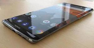
H5兼容 页面在华为部分曲面屏手机上会超出宽度?
//异常样式
//苹果等手机上正常样式
请问什么原因导致的?怎么解决?
<body><div class="plan">
<div class="plan_title"></div>
</div>
</body>
body {-moz-user-select: none;
-o-user-select: none;
-khtml-user-select: none;
-webkit-user-select: none;
-ms-user-select: none;
user-select: none;
width: 100vw;
display: flex;
justify-content: center;
}
.plan {
margin-left: 5px;
width: 69.4rem;
margin-top: 10.3rem;
}
.plan_title {
width: 62.1rem;
height: 10.4rem;
background-image: url(//xxxx/asset/img_planb/planb_title.png);
background-repeat: no-repeat;
background-size: 100%;
margin: 0 auto 6.3rem auto;
}
回答
特殊兼容一下吧,如果是华为,改变一下容器宽度。 const isHuawei = navigator.userAgent.toLowerCase().match(/huawei/i) == "huawei";
以上是 H5兼容 页面在华为部分曲面屏手机上会超出宽度? 的全部内容, 来源链接: utcz.com/a/59679.html