matplotlib/seaborn: first and last row cut in half of heatmap plot
When plotting heatmaps with seaborn (and correlation matrices with matplotlib) the first and the last row is cut in halve.
This happens also when I run this minimal code example which I found online.
import pandas as pdimport seaborn as sns
import matplotlib.pyplot as plt
data = pd.read_csv('https://raw.githubusercontent.com/resbaz/r-novice-gapminder-files/master/data/gapminder-FiveYearData.csv')
plt.figure(figsize=(10,5))
sns.heatmap(data.corr())
plt.show()
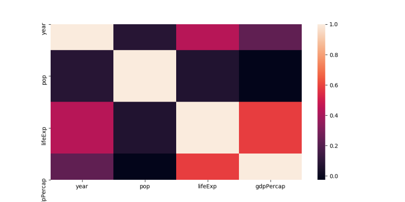
The labels at the y axis are on the correct spot, but the rows aren't completely there.
A few days ago, it work as intended. Since then, I installed texlive-xetex so I removed it again but it didn't solve my problem.
Any ideas what I could be missing?
Answer
Unfortunately matplotlib 3.1.1 broke seaborn heatmaps; and in general inverted axes with fixed ticks.
This is fixed in the current development version; you may hence
- revert to matplotlib 3.1.0
- use matplotlib 3.1.2 or higher
- set the heatmap limits manually (
ax.set_ylim(bottom, top) # set the ylim to bottom, top)
以上是 matplotlib/seaborn: first and last row cut in half of heatmap plot 的全部内容, 来源链接: utcz.com/a/38788.html