CSS巧用伪元素before和after制作绚丽效果
原创:叫我詹躲躲
来源:思否
链接:巧用伪元素before和after制作绚丽效果
所谓‘伪元素’,就是本身不存在的页面元素,HTML代码里并没有这样的元素,但在页面显示时,你却能看到这些本来不存在的元素发挥着作用。本文主要探究伪元素beforce和after的常用使用场景。
CSS :before 选择器
定义和说明
:before 选择器向选定的元素前插入内容。
使用content 属性来指定要插入的内容。
CSS :after 选择器
定义和说明
:after 选择器向选定的元素之后插入内容。
使用content 属性来指定要插入的内容。
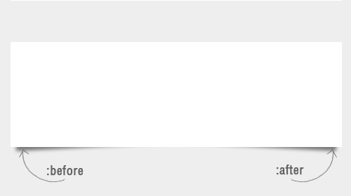
这两个伪元素会在真正页面元素之前和之后插入一个额外的元素,从技术角度上讲,它们与下面的HTML标记是等效的。
1.伪类光圈
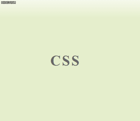
<div class="hover-circle">CSS</div>.hover-circle {width: 100%;
display: flex;
align-items: center;
justify-content: center;
height: 100%;
font-size: 3rem;
letter-spacing: 0.3rem;
font-weight: bold;
position: relative;
cursor: pointer;
color: #666;
}
.hover-circle::before {
width: 8.5rem;
height: 8.5rem;
border: 3px solid pink;
content: "";
border-radius: 50%;
position: absolute;
opacity: 0;
}
.hover-circle::after {
width: 7.2rem;
height: 7.2rem;
border: 6px solid pink;
content: "";
border-radius: 50%;
position: absolute;
opacity: 0;
}
.hover-circle:hover::before,
.hover-circle:hover::after {
animation-duration: 0.8s;
animation-delay: 0.2s;
animation: circle 0.8s;
}
@keyframes circle {
0% {
opacity: 0;
scale: 1;
}
25% {
opacity: 0.25;
}
50% {
opacity: 0.5;
scale: 1.03;
}
75% {
opacity: 0.75;
}
100% {
opacity: 1;
scale: 1.03;
}
}
2.伪类括号效果
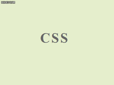
<div class="hover-text">CSS</div>.hover-text {width: 100%;
display: flex;
align-items: center;
justify-content: center;
height: 100%;
font-size: 3rem;
letter-spacing: 0.3rem;
font-weight: bold;
position: relative;
cursor: pointer;
color: #666;
}
.hover-text::before {
content: "[";
position: absolute;
left: 0.8rem;
opacity: 0;
color: #999;
}
.hover-text::after {
content: "]";
position: absolute;
right: 0.8rem;
opacity: 0;
color: #999;
}
.hover-text:hover::before {
animation-duration: 0.8s;
animation-delay: 0.2s;
animation: hovertext1 0.8s;
}
.hover-text:hover::after {
animation-duration: 0.8s;
animation-delay: 0.2s;
animation: hovertext2 0.8s;
}
@keyframes hovertext1 {
0% {
opacity: 0;
left: 0.8rem;
}
100% {
opacity: 1;
left: 0.5rem;
}
}
@keyframes hovertext2 {
0% {
opacity: 0;
right: 0.8rem;
}
100% {
opacity: 1;
right: 0.5rem;
}
}
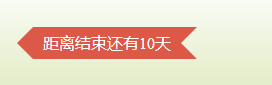
3.炫酷丝带效果
双边丝带
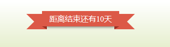
<div class="tc"><div class="title1"><span>距离结束还有10天</span></div>
</div>
.title1 {position: relative;
display: inline-block;
}
.title1 span {
position: relative;
z-index: 2;
display: inline-block;
padding: 0 15px;
height: 32px;
line-height: 32px;
background-color: #dc5947;
color: #fff;
font-size: 16px;
box-shadow: 0 10px 6px -9px rgba(0, 0, 0, 0.6);
}
.title1 span::before,
.title1 span::after {
position: absolute;
bottom: -6px;
border-width: 3px 5px;
border-style: solid;
content: "";
}
.title1 span::before {
left: 0;
border-color: #972f22 #972f22 transparent transparent;
}
.title1 span::after {
right: 0;
border-color: #972f22 transparent transparent #972f22;
}
.title1::before,
.title1::after {
position: absolute;
top: 6px;
content: "";
border-style: solid;
border-color: #dc5947;
}
.title1::before {
left: -32px;
border-width: 16px 26px 16px 16px;
border-left-color: transparent;
}
.title1::after {
right: -32px;
border-width: 16px 16px 16px 26px;
border-right-color: transparent;
}
右边丝带
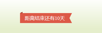
<span class="title2">距离结束还有10天</span>.title2 {position: relative;
display: inline-block;
padding: 0 15px;
height: 32px;
line-height: 32px;
background-color: #dc5947;
color: #fff;
font-size: 16px;
}
.title2::before {
position: absolute;
top: -4px;
left: 0;
border-width: 2px 4px;
border-style: solid;
border-color: transparent #972f22 #972f22 transparent;
content: "";
}
.title2::after {
position: absolute;
top: 0;
right: -8px;
border-width: 16px 8px 16px 0;
border-style: solid;
border-color: #dc5947 transparent #dc5947 #dc5947;
content: "";
}
箭头丝带
<span class="title3">距离结束还有10天</span>.title3 {position: relative;
display: inline-block;
margin-right: 16px;
padding: 0 10px;
height: 32px;
line-height: 32px;
background-color: #dc5947;
color: #fff;
font-size: 16px;
}
.title3::before {
position: absolute;
top: 0;
left: -16px;
border-width: 16px 16px 16px 0;
border-style: solid;
border-color: transparent #dc5947 transparent transparent;
content: "";
}
.title3::after {
position: absolute;
top: 0;
right: -16px;
border-width: 16px 16px 16px 0;
border-style: solid;
border-color: #dc5947 transparent #dc5947 #dc5947;
content: "";
}
多个箭头丝带
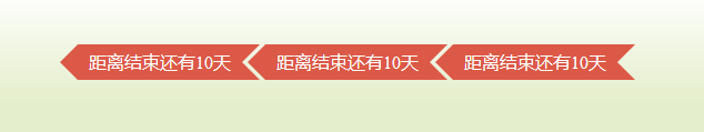
<div class="mt30 pl16"><span class="title3">距离结束还有10天</span>
<span class="title3 ml5">距离结束还有10天</span>
<span class="title3 ml5">距离结束还有10天</span>
</div>
.title4 {width: 200px;
height: 140px;
position: absolute;
top: -8px;
left: -8px;
overflow: hidden;
}
.title4::before {
position: absolute;
left: 124px;
border-radius: 8px 8px 0 0;
width: 16px;
height: 8px;
background-color: #972f22;
content: "";
}
.title4::after {
position: absolute;
left: 0;
top: 124px;
border-radius: 0 8px 8px 0;
width: 8px;
height: 16px;
background-color: #972f22;
content: "";
}
.title4 span {
display: inline-block;
text-align: center;
width: 200px;
height: 40px;
line-height: 40px;
position: absolute;
top: 30px;
left: -50px;
z-index: 2;
overflow: hidden;
-ms-transform: rotate(-45deg);
-moz-transform: rotate(-45deg);
-webkit-transform: rotate(-45deg);
-o-transform: rotate(-45deg);
transform: rotate(-45deg);
border: 1px dashed #fff;
box-shadow: 0 0 0 3px #dc5947, 0 14px 7px -9px rgba(0, 0, 0, 0.6);
background-color: #dc5947;
color: #fff;
}
悬挂标签
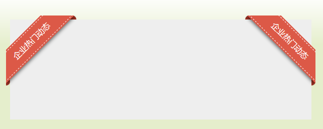
<div class="pr mt30"><div class="title4"><span>企业热门动态</span></div>
<div class="title5"><span>企业热门动态</span></div>
</div>
.title5 {width: 140px;
height: 200px;
position: absolute;
top: -8px;
right: -8px;
overflow: hidden;
}
.title5::before {
position: absolute;
right: 124px;
border-radius: 8px 8px 0 0;
width: 16px;
height: 8px;
background-color: #972f22;
content: "";
}
.title5::after {
position: absolute;
right: 0;
top: 124px;
border-radius: 0 8px 8px 0;
width: 8px;
height: 16px;
background-color: #972f22;
content: "";
}
.title5 span {
display: inline-block;
text-align: center;
width: 200px;
height: 40px;
line-height: 40px;
position: absolute;
top: 30px;
right: -50px;
z-index: 2;
overflow: hidden;
-ms-transform: rotate(45deg);
-moz-transform: rotate(45deg);
-webkit-transform: rotate(45deg);
-o-transform: rotate(45deg);
transform: rotate(45deg);
border: 1px dashed #fff;
box-shadow: 0 0 0 3px #dc5947, 0 14px 7px -9px rgba(0, 0, 0, 0.6);
background-color: #dc5947;
color: #fff;
}
4.几何图形
三角形
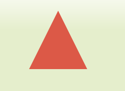
<div class="triangle"></div>.triangle {width: 0;
height: 0;
margin: 50px auto;
border-bottom: 100px solid #dc5947;
border-left: 50px solid transparent;
border-right: 50px solid transparent;
cursor: pointer;
transform: scale(1.2);
transition: 0.5s;
}
五角星
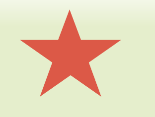
<div class="pentagram"></div>.pentagram {width: 0;
height: 0;
margin: 100px auto;
position: relative;
border-bottom: 70px solid #dc5947;
border-left: 100px solid transparent;
border-right: 100px solid transparent;
-webkit-transform: rotate(35deg);
-moz-transform: rotate(35deg);
-ms-transform: rotate(35deg);
-o-transform: rotate(35deg);
transform: rotate(35deg);
-webkit-transform: scale(1), rotate(35deg);
-moz-transform: scale(1), rotate(35deg);
-ms-transform: scale(1), rotate(35deg);
-o-transform: scale(1), rotate(35deg);
transform: scale(1), rotate(35deg);
}
.pentagram::after {
content: "";
width: 0;
height: 0;
border-bottom: 70px solid #dc5947;
border-left: 100px solid transparent;
border-right: 100px solid transparent;
-webkit-transform: rotate(-70deg);
-moz-transform: rotate(-70deg);
-ms-transform: rotate(-70deg);
-o-transform: rotate(-70deg);
transform: rotate(-70deg);
position: absolute;
top: 0px;
left: -100px;
}
.pentagram::before {
content: "";
width: 0;
height: 0;
border-bottom: 80px solid #dc5947;
border-left: 30px solid transparent;
border-right: 30px solid transparent;
-webkit-transform: rotate(-35deg);
-moz-transform: rotate(-35deg);
-ms-transform: rotate(-35deg);
-o-transform: rotate(-35deg);
transform: rotate(-35deg);
position: absolute;
top: -45px;
left: -60px;
}
5.水滴
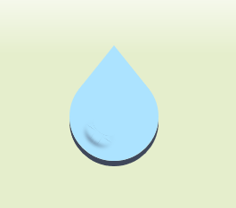
<div class="drop"></div>.drop::after {content: "";
position: absolute;
width: 30px;
height: 20px;
border-radius: 50%;
background-color: #ace3ff;
margin: 100px auto;
top: -50px;
left: 25px;
box-shadow: 5px 12px 4px #ace3ff, -5px 11px 4px #ace3ff, 0px 14px 4px #4d576e;
-webkit-transform: rotate(35deg);
}
.drop::before {
content: "";
position: absolute;
width: 0px;
height: 0px;
border-style: solid;
border-width: 0 40px 50px 40px;
border-color: transparent transparent #ace3ff transparent;
top: -30px;
left: 10px;
}
.drop {
width: 100px;
height: 100px;
border-radius: 50%;
background-color: #ace3ff;
position: relative;
margin: 100px auto;
box-shadow: 0px 6px 0 #3f475a;
}
6 绚丽流动边框
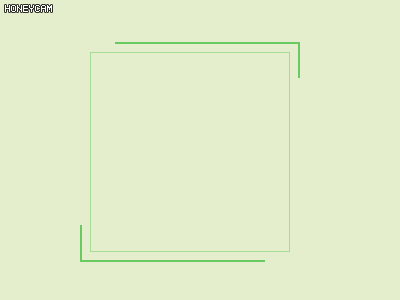
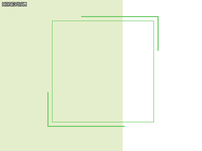
<div class="box-line1"></div>.box-line2,.box-line2::before,
.box-line2::after {
position: absolute;
top: 0;
bottom: 0;
left: 0;
right: 0;
}
.box-line2 {
width: 200px;
height: 200px;
margin: auto;
color: #69ca62;
box-shadow: inset 0 0 0 1px rgba(105, 202, 98, 0.5);
}
.box-line2::before,
.box-line2::after {
content: "";
z-index: 99;
margin: -5%;
box-shadow: inset 0 0 0 2px;
animation: clipMe 8s linear infinite;
}
.box-line2::before {
animation-delay: -4s;
}
.box-line2:hover::after,
.box-line2:hover::before {
background-color: rgba(255, 0, 0, 0.3);
}
@keyframes clipMe {
0%,
100% {
clip: rect(0px, 220px, 2px, 0px);
}
25% {
clip: rect(0px, 2px, 220px, 0px);
}
50% {
clip: rect(218px, 220px, 220px, 0px);
}
75% {
clip: rect(0px, 220px, 220px, 218px);
}
}
@keyframes surround {
0%,
100% {
clip: rect(0px, 220px, 2px, 0px);
}
25% {
clip: rect(0px, 2px, 220px, 0px);
}
50% {
clip: rect(218px, 220px, 220px, 0px);
}
75% {
clip: rect(0px, 220px, 220px, 218px);
}
}
.box-line1:before,
.box-line1:after {
position: absolute;
top: 0;
left: 0;
bottom: 0;
right: 0;
content: "";
z-index: 99;
margin: -5%;
animation: surround linear infinite 8s;
box-shadow: inset 0 0 0 2px #69ca62;
}
.box-line1:before {
animation-delay: -4s;
}
.box-line1 {
border: 1px solid #69ca62;
position: absolute;
left: 500px;
top: 200px;
margin: auto;
width: 200px;
height: 200px;
margin: auto;
}
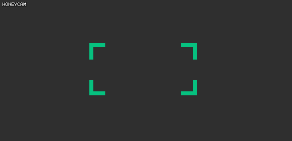
7.Tooltip提示
<div class="tip" data-tip="CSS伪类">CSS伪类</div>.tip::after {content: attr(data-tip);
display: none;
position: absolute;
padding: 5px 10px;
left: 15%;
bottom: 100%;
width: 150px;
margin-bottom: 12px;
transform: translateX(-50%);
font-size: 12px;
background: #000;
color: #fff;
cursor: default;
border-radius: 4px;
}
.tip::before {
content: " ";
position: absolute;
display: none;
left: 15%;
bottom: 100%;
transform: translateX(-50%);
margin-bottom: 3px;
width: 0;
height: 0;
border-left: 6px solid transparent;
border-right: 6px solid transparent;
border-top: 9px solid #000;
}
.tip:hover::after,
.tip:hover::before {
display: block;
}
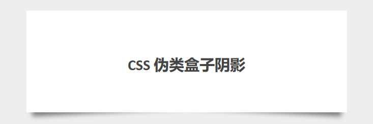
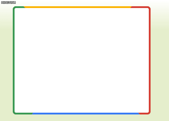
8.CSS 伪类盒子阴影
使用伪元素:before and :after制作出了完美惊艳的相片阴影效果。其中的技巧是使用绝对定位固定伪元素,然后给它们的z-index一个负值,以背景出现。
<div class="box effect2"><h3>CSS 伪类盒子阴影</h3>
</div>
.effect2 {position: relative;
}
.effect2::before, .effect2::after {
z-index: -1;
position: absolute;
content: "";
bottom: 15px;
left: 10px;
width: 50%;
top: 80%;
max-width: 300px;
background: #777;
-webkit-box-shadow: 0 15px 10px #777;
-moz-box-shadow: 0 15px 10px #777;
box-shadow: 0 15px 10px #777;
-webkit-transform: rotate(-3deg);
-moz-transform: rotate(-3deg);
-o-transform: rotate(-3deg);
-ms-transform: rotate(-3deg);
transform: rotate(-3deg);
}
.effect2::after {
-webkit-transform: rotate(3deg);
-moz-transform: rotate(3deg);
-o-transform: rotate(3deg);
-ms-transform: rotate(3deg);
transform: rotate(3deg);
right: 10px;
left: auto;
}

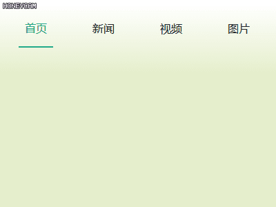
9.Tabs当前激活状态
<div class="sm-box flex"><div class="menu-tabs active">首页</div>
<div class="menu-tabs">新闻</div>
<div class="menu-tabs">视频</div>
<div class="menu-tabs">图片</div>
</div>
.menu-tabs {display: block;
padding: 0.25rem 1.5rem;
clear: both;
font-weight: 400;
color: #212529;
text-align: inherit;
white-space: nowrap;
background-color: transparent;
width: 50px;
border: 0;
height: 35px;
justify-content: center;
display: flex;
cursor: pointer;
}
.menu-tabs:hover {
color: #20a884;
position: relative;
}
.menu-tabs:hover:after {
position: absolute;
content: "";
border: 1px solid #20a884;
width: 3rem;
left: 0;
bottom: 0;
margin-left: 50%;
transform: translateX(-50%);
}
.active {
position: relative;
color: #20a884;
}
.flex {
display: flex;
}
.active::after {
position: absolute;
content: "";
border: 1px solid #20a884;
width: 3rem;
left: 0;
bottom: 0;
margin-left: 50%;
transform: translateX(-50%);
}
10.伪元素模糊背景
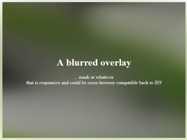
<div class="container"><div class="overlay">
<h1>A blurred overlay</h1>
<p>... mask or whatever
<br>that is responsive and could be cross-browser compatible back to IE9</p>
</div>
</div>
.container {width: 100%;
height: 100%;
margin: 0;
}
.container,
.overlay:before {
background: url(https://wow.techbrood.com/assets/landing.jpg) no-repeat fixed 0 0 / cover;
}
.container {
-webkit-box-align: center;
-webkit-align-items: center;
-ms-flex-align: center;
align-items: center;
display: -webkit-box;
display: -webkit-flex;
display: -ms-flexbox;
display: flex;
-webkit-box-pack: center;
-webkit-justify-content: center;
-ms-flex-pack: center;
justify-content: center;
}
.overlay {
max-height: 200px;
margin: 0 auto;
max-width: 768px;
padding: 50px;
position: relative;
color: white;
font-family: "Lato";
position: relative;
text-align: center;
z-index: 0;
}
.overlay:before {
content: "";
-webkit-filter: blur(100px);
filter: blur(100px);
height: 100%;
left: 0;
position: absolute;
top: 0;
width: 100%;
z-index: -1;
}
11.蓝湖文字
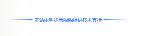
<span class="lanhu_text">本站由叫我詹躲躲提供技术支持
</span>
.lanhu_text {position: relative;
color: #2878ff;
}
.lanhu_text::before {
content: "";
width: 80px;
height: 20px;
position: absolute;
left: -86px;
top: 0;
background: url(data:image/png;base64,iVBORw0KGgoAAAANSUhEUgAAAFAAAAABCAYAAABJwyn/AAAAjElEQVQoU22NSw7CQAxDX8ahICF2HIDTcf9d1c8kaDpthQSL6CmxHRuk8cZfMxqf6DGh+Y5uCxquaB7xdUCXilZHWvBorEiOaqAKrkRRUEmUOw283TKRRb9b4GnIEpWmGYrA237kDh1w6J5N7zzzZv13gtuvT7t++jefUTYmwvpk7v3fPaCzn//9LfsBvRpHnliu+xMAAAAASUVORK5CYII=) 0 no-repeat;
}
.lanhu_text::after {
content: "";
width: 80px;
height: 20px;
position: absolute;
right: -86px;
top: 0;
background: url(data:image/png;base64,iVBORw0KGgoAAAANSUhEUgAAAFAAAAABCAYAAABJwyn/AAAAhElEQVQoU22OSw7CQAxDXzJDWbHiEFyRJQflFggJSjyDph9oC6snx45lO52rrKJqzIyNlkFUPv6vnv+3uW9vrPpBq77/uWFPAXnrnfYVQ16JiWq0stjvxKB9vDc/MeaXWo5cqDEFUkKpEuEoB3ollHvUZ9QV4rFD3R3d9ujwJK5HxAW9AStemAIOwCNlAAAAAElFTkSuQmCC) 100% no-repeat;
}
12 主要标题
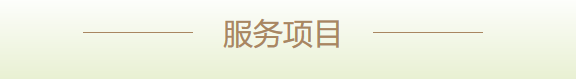
<div class="first-title">服务项目</div>.first-title {position: relative;
color: #a98661;
font-weight: 400;
font-size: 30px;
text-align: center;
}
.first-title::before,
.first-title::after {
position: absolute;
content: "";
width: 110px;
border-bottom: 1px solid #a98661;
top: 50%;
transform: translateY(-50%);
}
.first-title::before {
left: 100px;
}
.first-title::after {
right: 100px;
}
13.鼠标浮层遮罩浮层

<div class="black-mask"></div>.black-mask {position: relative;
height: 100%;
width: 100%;
cursor: pointer;
}
.black-mask:hover {
transition-duration: 1s;
scale: 1.02;
}
.black-mask:hover:before {
object-fit: cover;
}
.black-mask:hover:after {
height: 100%;
opacity: 1;
transition-duration: 1s;
display: flex;
align-items: flex-end;
padding: 0 30px 15px;
}
.black-mask::before {
position: absolute;
content: "";
background: url(https://dcdn.it120.cc/2019/11/14/f17c5848-6d1f-4254-b3ba-64d3969d16b6.jpg) no-repeat;
background-size: 100% 100%;
width: 100%;
height: 100%;
}
.black-mask::after {
position: absolute;
content: "雾在微风的吹动下滚来滚去,像冰峰雪山,似蓬莱仙境,如海市蜃楼,使人觉得飘然欲仙。山河景色在雾的装点下,变得更加美丽。远处的七连山巍峨挺拔,它们仿佛成了神仙住的宝山,令人神往。近处池塘边时时飘来雾气,在初升阳光的照耀下,呈现出赤、橙、黄、绿、青、蓝、紫七种色彩。......";
width: 90%;
height: 0%;
bottom: 0;
right: 0;
z-index: 32;
background: rgba(0, 0, 0, 0.3);
opacity: 1;
color: #fff;
opacity: 0;
padding: 0 30px 0;
}
14.绚丽光圈
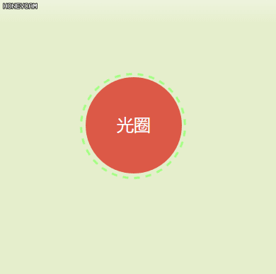
<div class="aperture">光圈</div>.aperture {width: 136px;
height: 136px;
background-color: #dc5947;
border-radius: 50%;
line-height: 136px;
text-align: center;
color: #fff;
font-size: 24px;
cursor: pointer;
position: relative;
}
.aperture::before {
border: 3px dashed #a0ff80;
content: "";
width: 144px;
height: 144px;
position: absolute;
border-radius: 50%;
left: -8px;
top: -6px;
animation: clockwise 5s linear infinite;
}
@keyframes clockwise {
100% {
transform: rotate(360deg);
}
}
15.彩色流动边框
<div class="rainbow"></div>.rainbow {position: relative;
z-index: 0;
width: 400px;
height: 300px;
border-radius: 10px;
overflow: hidden;
padding: 2rem;
}
.rainbow::before {
content: '';
position: absolute;
z-index: -2;
left: -50%;
top: -50%;
width: 200%;
height: 200%;
background-color: #399953;
background-repeat: no-repeat;
background-size: 50% 50%, 50% 50%;
background-position: 0 0, 100% 0, 100% 100%, 0 100%;
background-image: linear-gradient(#399953, #399953), linear-gradient(#fbb300, #fbb300), linear-gradient(#d53e33, #d53e33), linear-gradient(#377af5, #377af5);
-webkit-animation: rotate 4s linear infinite;
animation: rotate 4s linear infinite;
}
.rainbow::after {
content: '';
position: absolute;
z-index: -1;
left: 6px;
top: 6px;
width: calc(100% - 12px);
height: calc(100% - 12px);
background: white;
border-radius: 5px;
}
@keyframes rotate {
100% {
-webkit-transform: rotate(1turn);
transform: rotate(1turn);
}
}
16.炫酷伪类边框
<div class="corner-button">CSS3</div>.corner-button::before, .corner-button::after {content: '';
position: absolute;
background: #2f2f2f;
z-index: 1;
transition: all 0.3s;
}
.corner-button::before {
width: calc(100% - 3rem);
height: calc(101% + 1rem);
top: -0.5rem;
left: 50%;
-webkit-transform: translateX(-50%);
transform: translateX(-50%);
}
.corner-button::after {
height: calc(100% - 3rem);
width: calc(101% + 1rem);
left: -0.5rem;
top: 50%;
-webkit-transform: translateY(-50%);
transform: translateY(-50%);
}
.corner-button:hover {
color: pink;
}
.corner-button {
font-family: 'Lato', sans-serif;
letter-spacing: .02rem;
cursor: pointer;
background: transparent;
border: 0.5rem solid currentColor;
padding: 1.5rem 2rem;
font-size: 2.2rem;
color: #06c17f;
position: relative;
transition: color 0.3s;
text-align: center;
margin: 5rem 12rem;
}
.corner-button:hover::after {
height: 0;
}
.corner-button:hover::before {
width: 0;
}
.bg-f2{
background: #2f2f2f;
}
17.伪类美化文字
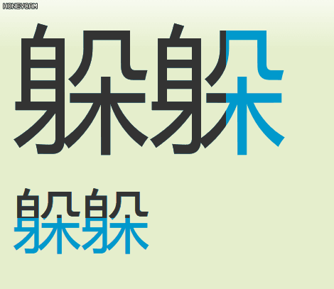
<div class="beautify-font" data-text='躲躲'>躲躲</div><div class="beautify-font2" data-text='躲躲'>躲躲</div>
.beautify-font{position: relative;
font-size: 12rem;
color: #0099CC
}
.beautify-font::before{
position: absolute;
font-size: 12rem;
color: #333;
content: attr(data-text);
white-space:nowrap;
width: 50%;
display: inline-block;
overflow: hidden;
transition:1s ease-in-out 0s;
}
.beautify-font2{
position: relative;
font-size: 6rem;
color: #0099CC
}
.beautify-font2::before{
position: absolute;
font-size: 6rem;
color: #333;
content: attr(data-text);
white-space:nowrap;
height: 50%;
display: inline-block;
overflow: hidden;
transition:1s ease-in-out 0s;
}
.beautify-font:hover::before{
width:0;
}
.beautify-font2:hover::before{
height: 0;
}
18.照片堆叠效果
只使用一张图片来创造出一堆图片叠摞在一起的效果,能做到吗?当然,关键是要使用伪元素:before和:after来帮助呈现。把这些伪元素的z-index设置成负值,让它们以背景方式起作用。
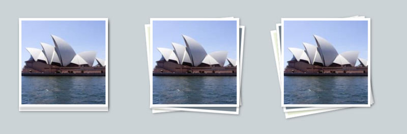
<div class="stackthree"><img></div>.stackthree::before {background: #eff4de;
}
.stackthree, .stackthree::before, .stackthree::after {
border: 6px solid #fff;
height: 200px;
width: 200px;
-webkit-box-shadow: 2px 2px 5px rgba(0,0,0,0.3);
-moz-box-shadow: 2px 2px 5px rgba(0,0,0,0.3);
box-shadow: 2px 2px 5px rgba(0,0,0,0.3);
}
.stackthree::before {
top: 5px;
left: -15px;
z-index: -1;
-webkit-transform: rotate(-10deg);
-moz-transform: rotate(-10deg);
-o-transform: rotate(-10deg);
-ms-transform: rotate(-10deg);
transform: rotate(-10deg);
}
.stackthree::after {
top: -2px;
left: -10px;
-webkit-transform: rotate(-5deg);
-moz-transform: rotate(-5deg);
-o-transform: rotate(-5deg);
-ms-transform: rotate(-5deg);
transform: rotate(-5deg);
}
.stackthree::before, .stackthree::after {
background: #768590;
content: "";
position: absolute;
z-index: -1;
height: 0px\9;
width: 0px\9;
border: none\9;
}
.stackthree {
float: left;
position: relative;
margin: 50px;
}
为元素的兼容性
不论你使用单冒号还是双冒号语法,浏览器都能识别。因为IE8只支持单冒号的语法,所以,如果你想兼容IE8,保险的做法是使用单冒号。
以上是 CSS巧用伪元素before和after制作绚丽效果 的全部内容, 来源链接: utcz.com/a/35933.html