Flutter NavigationRail
Flutter 1.17 Widget 之 NavigationRail 初探
Flutter 1.17 版本中加入了一个新的 Widget NavigationRail ,接下来就让我们来简单看一下这个 Widget 如何使用。
如果 Flutter SDK 不是最新版本请通过 flutter upgrade 命令来升级 SDK 。
flutter upgrade一、NavigationRail 介绍
NavigationRail 这个组件是一个材料设计风格的组件,通常展示在应用程序的左边或者右边,通过这个组件来进行页面的导航,通常来说页面数量都是3个或者5个以内。
NavigationRail 一般都是定义为 Row 的第一个或者最后一个元素,而 Row 都是做为 Scaffold 里面的 body 来进行布局。
NavigationRail 这个组件是为大屏设备布局设计的,如桌面程序、Web 或者平板设备等大屏设备上,而像手机这样的竖屏小屏设备,一般都是使用 BottomNavigationBar 来实现导航功能。
二、典型的使用方式和页面结构
和 BottomNavigationBar 一样具有导航功能,但是 NavigationRail 的使用方式和 BottomNavigationBar 完全不同,不像 BottomNavigationBar 一样,可以做为Scaffold 中的一个参数来使用 。
一般来说,想要使用 NavigationRail,都是用 Row 做为 Scaffold 的 body 组件,而 NavigationRail 做为 Row 的第一个或者最后一个元素,这样导航就会定义在最左边或者最右边,如果使用了 NavigationRail,那么剩下的布局通常都是使用 Expanded,这样才会占满屏幕的剩余空间。
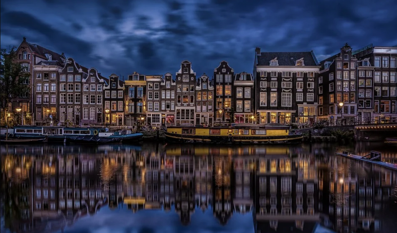
典型的页面结构是这样的。
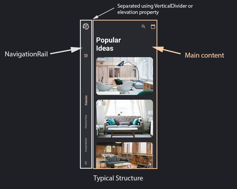
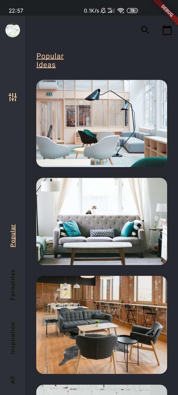
当然,完全可以进一步美化,比如,这样的。
典型的代码结构如下。
Scaffold(//row 做为 body 布局
body: Row(
children: <Widget>[
NavigationRail(
selectedIndex: _selectedIndex,
onDestinationSelected: (int index) {
setState(() {
_selectedIndex = index;
});
},
labelType: NavigationRailLabelType.selected,
destinations: [
NavigationRailDestination(
icon: Icon(Icons.favorite_border),
selectedIcon: Icon(Icons.favorite),
label: Text('First'),
),
NavigationRailDestination(
icon: Icon(Icons.bookmark_border),
selectedIcon: Icon(Icons.book),
label: Text('Second'),
),
NavigationRailDestination(
icon: Icon(Icons.star_border),
selectedIcon: Icon(Icons.star),
label: Text('Third'),
),
],
),
VerticalDivider(thickness: 1, width: 1),
// This is the main content.
//Expanded 占满剩下屏幕空间
Expanded(
child: Center(
child: Text('selectedIndex: $_selectedIndex'),
),
)
],
),
);
三、属性说明
const NavigationRail({this.backgroundColor, //背景色
this.extended = false, //是否是扩展状态
this.leading, //destinations 上的 widget 布局
this.trailing, // destinations 下方的 widget
@required this.destinations, //导航条
@required this.selectedIndex, //当前选中的页面索引
this.onDestinationSelected, //点击了导航的图标的回调
this.elevation, //z 轴方向高度
this.groupAlignment, //对齐方式
this.labelType, //选择标签时的效果
this.unselectedLabelTextStyle, //没有选中的标签的样式
this.selectedLabelTextStyle, //选中的标签的样式
this.unselectedIconTheme, //未被选中的标签文字样式
this.selectedIconTheme, //选中的标签文字样式
this.minWidth,
this.minExtendedWidth,
}) : assert(destinations != null && destinations.length >= 2),
assert(selectedIndex != null),
assert(0 <= selectedIndex && selectedIndex < destinations.length),
assert(elevation == null || elevation > 0),
assert(minWidth == null || minWidth > 0),
assert(minExtendedWidth == null || minExtendedWidth > 0),
assert((minWidth == null || minExtendedWidth == null) || minExtendedWidth >= minWidth),
assert(extended != null),
assert(!extended || (labelType == null || labelType == NavigationRailLabelType.none));
destinations 代表了导航条,类型是 NavigationRailDestination 数组类型,NavigationRailDestination 就代表了每一个 item 。
类似 BottomNavigationBar , NavigationRail 导航的item 也有选中和未选中的状态,可以设置不同的样式。
destinations: [NavigationRailDestination(
icon: Icon(Icons.favorite_border),
selectedIcon: Icon(Icons.favorite),
label: Text('First'),
),
NavigationRailDestination(
icon: Icon(Icons.bookmark_border),
selectedIcon: Icon(Icons.book),
label: Text('Second'),
),
NavigationRailDestination(
icon: Icon(Icons.star_border),
selectedIcon: Icon(Icons.star),
label: Text('Third'),
),
],
通常来说,每一个 item 都有三个元素: icon、selectedIcon 和 label 。

- icon
未被选中状态下的图标(通常都是轮廓)。
- selectedIcon
可选的,选择状态下的图标。
- label
必须要有的,图标下方的描述文字。
四、示例
class NanigationRailMain extends StatefulWidget {@override
NanigationRailMainState createState() => NanigationRailMainState();
}
class NanigationRailMainState extends State<NanigationRailMain> {
int _selectedIndex = 0;
final padding = 8.0;
@override
Widget build(BuildContext context) {
return Scaffold(
backgroundColor: Color(0xff28292E),
body: SafeArea(
child: Row(
children: <Widget>[
NavigationRail(
minWidth: 56.0,
groupAlignment: 1.0,
backgroundColor: Color(0xff2D3035),
selectedIndex: _selectedIndex,
onDestinationSelected: (int index) {
setState(() {
_selectedIndex = index;
});
},
labelType: NavigationRailLabelType.all,
leading: Column(
children: <Widget>[
SizedBox(
height: 8,
),
Center(
child: CircleAvatar(
radius: 16,
backgroundImage: NetworkImage(
"https://t9.baidu.com/it/u=86853839,3576305254&fm=79&app=86&size=h300&n=0&g=4n&f=jpeg?sec=1591363041&t=58576d535d450f80e9248bd0ee84c8c0"),
),
),
SizedBox(
height: 108,
),
RotatedBox(
quarterTurns: -1,
child: IconButton(
icon: Icon(Icons.tune),
color: Color(0xffFCCFA8),
onPressed: () {},
),
)
],
),
selectedLabelTextStyle: TextStyle(
color: Color(0xffFCCFA8),
fontSize: 13,
letterSpacing: 0.8,
decoration: TextDecoration.underline,
decorationThickness: 2.0,
),
unselectedLabelTextStyle: TextStyle(
fontSize: 13,
letterSpacing: 0.8,
),
destinations: [
buildRotatedTextRailDestination("Popular", padding),
buildRotatedTextRailDestination("Favourites", padding),
buildRotatedTextRailDestination("Inspiration", padding),
buildRotatedTextRailDestination("All", padding),
],
),
// This is the main content.
ContentSpace(_selectedIndex)
],
),
),
);
}
}
NavigationRailDestination buildRotatedTextRailDestination(
String text, double padding) {
return NavigationRailDestination(
icon: SizedBox.shrink(),
label: Padding(
padding: EdgeInsets.symmetric(vertical: padding),
child: RotatedBox(
quarterTurns: -1,
child: Text(text),
),
),
);
}
class ContentSpace extends StatelessWidget {
final int _selectedIndex;
ContentSpace(this._selectedIndex);
final List<String> images = [
"https://images.unsplash.com/photo-1524758631624-e2822e304c36?ixlib=rb-1.2.1&ixid=eyJhcHBfaWQiOjEyMDd9&auto=format&fit=crop&w=1350&q=80",
"https://images.unsplash.com/photo-1493663284031-b7e3aefcae8e?ixlib=rb-1.2.1&ixid=eyJhcHBfaWQiOjEyMDd9&auto=format&fit=crop&w=1350&q=80",
"https://images.unsplash.com/photo-1538688525198-9b88f6f53126?ixlib=rb-1.2.1&ixid=eyJhcHBfaWQiOjEyMDd9&auto=format&fit=crop&w=1267&q=80",
"https://images.unsplash.com/photo-1513161455079-7dc1de15ef3e?ixlib=rb-1.2.1&ixid=eyJhcHBfaWQiOjEyMDd9&auto=format&fit=crop&w=634&q=80",
"https://images.unsplash.com/photo-1544457070-4cd773b4d71e?ixlib=rb-1.2.1&ixid=eyJhcHBfaWQiOjEyMDd9&auto=format&fit=crop&w=843&q=80",
"https://images.unsplash.com/photo-1532323544230-7191fd51bc1b?ixlib=rb-1.2.1&ixid=eyJhcHBfaWQiOjEyMDd9&auto=format&fit=crop&w=634&q=80",
"https://images.unsplash.com/photo-1549488344-cbb6c34cf08b?ixlib=rb-1.2.1&ixid=eyJhcHBfaWQiOjEyMDd9&auto=format&fit=crop&w=634&q=80",
];
final List<String> titles = [
"PopularnIdeas",
"Favourites",
"InspirationnIdeas",
"All"
];
@override
Widget build(BuildContext context) {
return Expanded(
child: Padding(
padding: const EdgeInsets.fromLTRB(24, 8, 0, 0),
child: MediaQuery.removePadding(
removeTop: true,
context: context,
child: ListView(
children: <Widget>[
Row(
mainAxisAlignment: MainAxisAlignment.end,
children: <Widget>[
IconButton(
icon: Icon(Icons.search),
onPressed: () {},
),
IconButton(
icon: Icon(Icons.calendar_today),
onPressed: () {},
),
],
),
SizedBox(
height: 24,
),
Text(titles[_selectedIndex],
style: TextStyle(
color: Color(0xffFCCFA8),
fontSize: 16,
letterSpacing: 0.8,
decoration: TextDecoration.underline,
decorationThickness: 2.0,
),
),
SizedBox(
height: 24,
),
for (var i in images) ImageCard(i),
],
),
),
),
);
}
}
class ImageCard extends StatelessWidget {
final uri;
@override
Widget build(BuildContext context) {
return Card(
margin: const EdgeInsets.fromLTRB(0, 0, 24, 24),
child: Image.network(uri),
clipBehavior: Clip.antiAliasWithSaveLayer,
elevation: 0.0,
shape: RoundedRectangleBorder(
borderRadius: BorderRadius.circular(16),
),
);
}
const ImageCard(this.uri);
}
效果
以上是 Flutter NavigationRail 的全部内容, 来源链接: utcz.com/a/19340.html