Flutter组件大全:代码及示例
1.Align组件
classMyAppextendsStatelessWidget{@override
Widget build(BuildContext context) {
return MaterialApp(
title: 'ALign组件',
home: Scaffold(
appBar: AppBar(
title: Text('Align组件')
),
body: Container(
width: 200.0,
height: 300.0,
/**
* 指定容器的宽度后, ALign的widthFactor将无效
*
*/
// ==============================================
color: Colors.red,
child: Align(
// 对齐方式
alignment: Alignment(0, 1.0),
/**
* Alignment.center = bottomCenter.topRight 等
* alignment: Alignment(0, 0),中间是 (0,0) 从-1.0 ~ 1.0
* */
// =================================================
widthFactor: 3.0, // 宽度的2倍(根据子组件大小,填充父容器大小)
heightFactor: 4.0, // 宽度的2倍(根据子组件大小)
/**
* 在父容器宽高不确定的情况下
* 如果不指定Container 的情况下
* */
// ==============================================
child: Container(
color: Colors.green,
width: 100.0,
height: 50.0,
child: Text(
'bottomCentent',
style: TextStyle(
color: Colors.white
)
)
),
)
)
),
);
}
}
2.AppBar
classMyAppextendsStatelessWidget{@override
Widget build(BuildContext context) {
return MaterialApp(
title: 'ALign组件',
home: Scaffold(
appBar: AppBar(
title: Text('Align组件')
),
body: DemoPage()
),
);
}
}
classDemoPageextendsStatefulWidget{
@override
_DemoPageState createState() => _DemoPageState();
}
class_DemoPageStateextendsState<DemoPage>{
@override
Widget build(BuildContext context) {
return SizedBox(
height: 200.0,
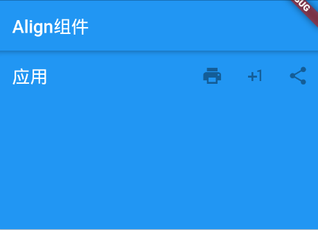
child: AppBar(
title: Text('应用'),
actions: <Widget>[
IconButton(
icon: Icon(Icons.print),
onPressed: null,
tooltip: '打印',
),
IconButton(
icon: Icon(Icons.plus_one),
onPressed: null,
tooltip: '更多',
),
IconButton(
icon: Icon(Icons.share),
onPressed: null,
tooltip: '分享',
),
],
),
);
}
}
import'package:flutter/material.dart';void main(){
runApp(
MyApp()
);
}
classMyAppextendsStatelessWidget{
@override
Widget build(BuildContext context) {
return MaterialApp(
title: 'ALign组件',
home: Scaffold(
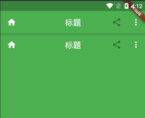
appBar: AppBar(
title: Text('标题'),
// 左侧图标
leading: Icon(Icons.home),
// 整个AppBar的背景
backgroundColor: Colors.green,
// 居中标题
centerTitle: true,
// 右侧图标
actions: <Widget>[
IconButton(
icon: Icon(Icons.share),
onPressed: null,
tooltip: '分享',
),
// 菜单按钮
PopupMenuButton<String>(
itemBuilder: (BuildContext content) => <PopupMenuItem<String>>[
// 菜单项
PopupMenuItem<String>(
value: 'friend',
child: Text('分享到朋友圈'),
),
PopupMenuItem<String>(
value: 'download',
child: Text('下载到本地'),
)
],
)
],
),
body: DemoPage()
),
);
}
}
classDemoPageextendsStatefulWidget{
@override
_DemoPageState createState() => _DemoPageState();
}
class_DemoPageStateextendsState<DemoPage>{
@override
Widget build(BuildContext context) {
return SizedBox(
height: 500,
child: AppBar(
title: Text('标题'),
// 左侧图标
leading: Icon(Icons.home),
// 整个AppBar的背景
backgroundColor: Colors.green,
// 居中标题
centerTitle: true,
// 右侧图标
actions: <Widget>[
IconButton(
icon: Icon(Icons.share),
onPressed: null,
tooltip: '分享',
),
// 菜单按钮
PopupMenuButton<String>(
itemBuilder: (BuildContext content) => <PopupMenuItem<String>>[
// 菜单项
PopupMenuItem<String>(
value: 'friend',
child: Text('分享到朋友圈'),
),
PopupMenuItem<String>(
value: 'download',
child: Text('下载到本地'),
)
],
)
],
),
);
}
}
3.BottomAppBar组件
classMyAppextendsStatelessWidget{@override
Widget build(BuildContext context) {
return MaterialApp(
title: 'BottomAppBar组件',
home: Scaffold(
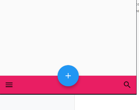
// FAB按钮位置
floatingActionButtonLocation: FloatingActionButtonLocation.centerDocked, // 悬停在底部正中间
// FAB按钮
floatingActionButton: FloatingActionButton(
child: Icon(Icons.add),
onPressed: null,
),
// 底部应用栏
bottomNavigationBar: BottomAppBar(
// floatingActionButton 和 BottomAppBar 之间的距离
notchMargin: 10.0,
// 底部应用背景色
color: Colors.pink,
child: Row(
// 设置大小
mainAxisSize: MainAxisSize.max,
// 对齐方式
mainAxisAlignment: MainAxisAlignment.spaceBetween,
children: <Widget>[
IconButton(
icon: Icon(Icons.menu),
onPressed: (){},
),
IconButton(
icon: Icon(Icons.search),
onPressed: (){},
)
]
),
),
body: null
),
);
}
}
4.ButtonBar组件
@overrideWidget build(BuildContext context) {
// 末端按钮对齐的容器
return Center(
child: ButtonBar(
// 对齐方式 默认为末端对齐
alignment: MainAxisAlignment.end,
// child 大小
mainAxisSize: MainAxisSize.min,
children: <Widget>[
RaisedButton(
child: Text('首页'),
color: Colors.yellowAccent,
onPressed: null
),
RaisedButton(
child: Text('发布'),
color: Colors.yellow,
onPressed: null
),
RaisedButton(
child: Text('我的'),
color: Colors.yellowAccent,
onPressed: null
)
]
),
);
}
5.FlexibleSpace组件
classMyAppextendsStatelessWidget{@override
Widget build(BuildContext context) {
return MaterialApp(
title: 'FlexibleSpace组件',
home: Scaffold(
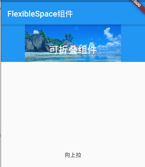
appBar: AppBar(
title: Text('FlexibleSpace组件')
),
body: NestedScrollView(
headerSliverBuilder: (BuildContext context, bool innerBoxIsScrolled){
return <Widget>[
SliverAppBar(
// 展开高度
expandedHeight: 150.0,
// 是否随滑动隐藏
floating: false,
// 是否固定在顶部
pinned: true,
flexibleSpace: FlexibleSpaceBar(
centerTitle: true,
title: Text(
'可折叠组件',
style: TextStyle(
color: Colors.white
),
),
background: Image.network('https://ss0.bdstatic.com/94oJfD_bAAcT8t7mm9GUKT-xh_/timg?image&quality=100&size=b4000_4000&sec=1590326522&di=83b46be42e8b62d86b43ecc4d9731e17&src=http://www.bizhidaquan.com/d/file/1/1159829.jpg'),
)
)
];
},
body: Center(
child: Text('向上拉')
)
)
),
);
}
}
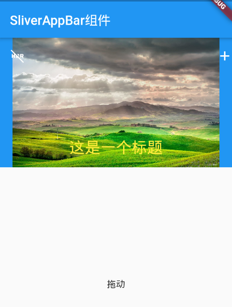
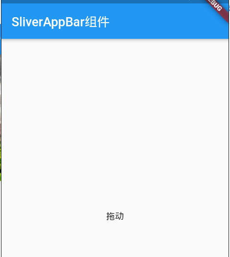
6.SliverAppBar组件
classMyAppextendsStatelessWidget{@override
Widget build(BuildContext context) {
return MaterialApp(
title: 'SliverAppBar组件',
home: Scaffold(
appBar: AppBar(
title: Text('SliverAppBar组件')
),
body: Domes()
),
);
}
}
// 可滚动的组件
classDomesextendsStatelessWidget{
@override
Widget build(BuildContext context) {
return NestedScrollView(
headerSliverBuilder: (BuildContext context, bool innerBoxScrolled){
return <Widget>[
SliverAppBar(
// 是否预留高度
primary: true,
// 左侧图标
leading: Icon(Icons.hdr_off),
// 右侧图标
actions: <Widget>[
Icon(Icons.add)
],
// Z轴阴影
elevation: 10.0,
// true 固定在顶部 false 完全隐藏
pinned: false,
// 可扩展区域高度
expandedHeight: 200.0,
// 与 floating 结合使用
snap: false,
// 是否随着滑动隐藏标题
floating: false,
// 扩展区域
flexibleSpace: FlexibleSpaceBar(
centerTitle: true,
title: Text(
'这是一个标题',
style: TextStyle(
color: Colors.yellow,
fontSize: 16.0
)
),
background: Image.network(
'https://timgsa.baidu.com/timg?image&quality=80&size=b9999_10000&sec=1590337388247&di=6637f1e38c9da6fa343735f749080e24&imgtype=0&src=http%3A%2F%2Fimg4.imgtn.bdimg.com%2Fit%2Fu%3D3004831859%2C2611273449%26fm%3D214%26gp%3D0.jpg'),
),
)
];
},
body: Center(
child: Text('拖动')
)
);
}
}
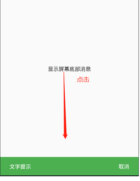
7.SnackBar组件
classMyAppextendsStatelessWidget{@override
Widget build(BuildContext context) {
return MaterialApp(
title: 'SnackBar组件',
home: Scaffold(
appBar: AppBar(
title: Text('SnackBar组件')
),
body: Domes()
),
);
}
}
// 可滚动的组件
classDomesextendsStatelessWidget{
@override
Widget build(BuildContext context) {
return Center(
child: GestureDetector(
onTap:(){
final snackBar = SnackBar(
// 提示信息
content: Text('文字提示'),
// 背景色
backgroundColor: Colors.green,
// 操作
action: SnackBarAction(
textColor: Colors.white,
label: '取消',
onPressed: (){
}
),
// 持续时间
duration: Duration(minutes: 1), // 1分钟
);
Scaffold.of(context).showSnackBar(snackBar);// final snackBar
},
child: Text('显示屏幕底部消息'),
)
);
}
}
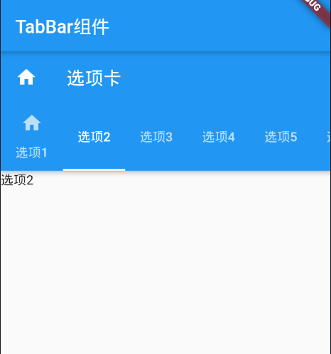
8.TabBar组件
classMyAppextendsStatelessWidget{@override
Widget build(BuildContext context) {
return MaterialApp(
title: 'TabBar组件',
home: Scaffold(
appBar: AppBar(
title: Text('TabBar组件')
),
body: DemoPage()
),
);
}
}
// SingleTickerProviderStateMixin(切换动画) 必须用在有状态组件
classDemoPageextendsStatefulWidget{
@override
_DemoPageState createState() => _DemoPageState();
}
class_DemoPageStateextendsState<DemoPage> withSingleTickerProviderStateMixin{
ScrollController _scrollViewController;
TabController _tabController;
// 初始化完成
@override
void initState(){
super.initState();
_scrollViewController = ScrollController();
// 长度要和 展示部分一致
_tabController = TabController(vsync: this, length: 6);
}
// 应用销毁时
@override
void dispose(){
super.initState();
// 销毁
_scrollViewController.dispose();
_tabController.dispose();
super.dispose();
}
@override
Widget build(BuildContext context) {
// 末端按钮对齐的容器
return SizedBox(
height: 500.0,
child: Scaffold(
appBar: AppBar(
title: Text('选项卡'),
// 前置图标
leading: Icon(Icons.home),
// 背景色
backgroundColor: Colors.blue,
// 标题选项卡
bottom: TabBar(
controller: _tabController,
// 是否可以滚动
isScrollable: true,
tabs: <Widget>[
Tab(
text: "选项1",
icon: Icon(Icons.home),
),
Tab(
text: "选项2"
),
Tab(text: "选项3"),
Tab(text: "选项4"),
Tab(text: "选项5"),
Tab(text: "选项6"),
]
),
),
// 切换内容
body: TabBarView(controller: _tabController,
children: <Widget>[
Text('选项1'),
Text('选项2'),
Text('选项3'),
Text('选项4'),
Text('选项5'),
Text('选项6')
]
),
),
);
}
}
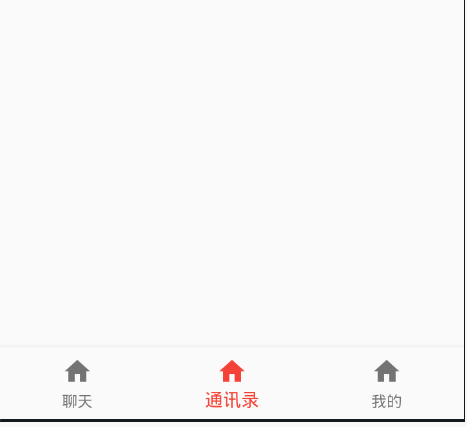
9.BottomNavigationBar组件
classMyAppextendsStatelessWidget{@override
Widget build(BuildContext context) {
return MaterialApp(
title: 'BottomNavigationBar组件',
home: Scaffold(
appBar: AppBar(
title: Text('BottomNavigationBar组件')
),
body: Container(
width: 200.0,
height: 500.0
),
bottomNavigationBar: DemoPage(),
),
);
}
}
classDemoPageextendsStatefulWidget{
@override
_DemoPageState createState() => _DemoPageState();
}
class_DemoPageStateextendsState<DemoPage> {
// 当前Index
int _currentIndex = 1;
void _onItemTapped(int index){
print(index);
setState(() {
_currentIndex = index;
});
}
@override
Widget build(BuildContext context) {
return BottomNavigationBar(
// 底部按钮类型
type: BottomNavigationBarType.fixed, // fixed 固定
// 按钮大小
iconSize: 24.0,
onTap: _onItemTapped,
// 当前索引
currentIndex: _currentIndex,
// 选中颜色
fixedColor: Colors.red,
items: <BottomNavigationBarItem>[
BottomNavigationBarItem(
title: Text('聊天'),
icon: Icon(Icons.home)
),
BottomNavigationBarItem(
title: Text('通讯录'),
icon: Icon(Icons.home)
),
BottomNavigationBarItem(
title: Text('我的'),
icon: Icon(Icons.home)
)
]
);
}
}
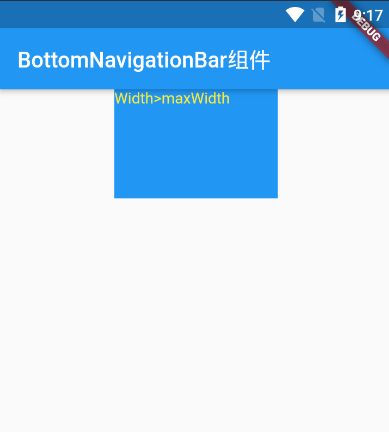
10.BottomNavigationBar组件
classMyAppextendsStatelessWidget{@override
Widget build(BuildContext context) {
return MaterialApp(
title: 'BottomNavigationBar组件',
home: Scaffold(
appBar: AppBar(
title: Text('BottomNavigationBar组件')
),
body: Center(
child: Column(
children: <Widget>[
// 添加一个指定大小的盒子,限定其最大最小宽高
ConstrainedBox(
constraints: const BoxConstraints(
maxHeight: 100.0,
minHeight: 20.0,
maxWidth: 200.0,
minWidth: 60.0
),
child: Container(
width: 150.0,
height: 100,
color: Colors.blue,
child: Text(
'Width>maxWidth',
style: TextStyle(
color: Colors.yellow
)
)
),
)
]
)
),
bottomNavigationBar: DemoPage(),
),
);
}
}
以上是 Flutter组件大全:代码及示例 的全部内容, 来源链接: utcz.com/a/18149.html