使用CSS保持div的长宽比
我想创建一个div可以随窗口宽度变化而改变其宽度/高度的。
是否有任何CSS3规则可以允许高度根据宽度而改变,同时保持其长宽比?
我知道我可以通过JavaScript来做到这一点,但我宁愿只使用CSS。
回答:
只需<div>使用百分比值创建包装器padding-bottom,如下所示:
div { width: 100%;
padding-bottom: 75%;
background: gold; /** <-- For the demo **/
}
/* demonstration purposed only : non-essential */
.demoWrapper {
padding: 10px;
background: white;
box-sizing: border-box;
resize: horizontal;
border: 1px dashed;
overflow: auto;
max-width: 100%;
height: calc(100vh - 16px);
}
<div class="demoWrapper"> <div></div>
</div>
它将导致<div>高度等于其容器宽度的75%(长宽比为4:3)。
这取决于以下事实:
相对于生成的盒子的包含块的宽度计算百分比(来源:w3.org,强调我的)
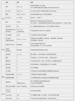
其他长宽比和100%宽度的填充底部值:
aspect ratio | padding-bottom value--------------|----------------------
16:9 | 56.25%
4:3 | 75%
3:2 | 66.66%
8:5 | 62.5%
将内容放在div中:
为了保持div的长宽比并防止其内容拉伸,您需要添加一个绝对定位的子级,并使用以下方法将其拉伸到包装的边缘:
div.stretchy-wrapper { position: relative;
}
div.stretchy-wrapper > div {
position: absolute;
top: 0; bottom: 0; left: 0; right: 0;
}
以上是 使用CSS保持div的长宽比 的全部内容, 来源链接: utcz.com/qa/434131.html