flex-shrink 的一个问题
描述
看如下代码,同时设置子元素的 flex-shrink 和 宽度 width 会出现什么情况
相关代码
<!DOCTYPE html><html lang="en">
<head>
<meta charset="UTF-8" />
<meta name="viewport" content="width=device-width, initial-scale=1.0" />
<title>Document</title>
<style>
.container {
width: 200px;
height: 100px;
display: flex;
}
.box {
height: 100px;
}
.box1 {
flex-shrink: 2;
width: 100px;
background-color: gold;
}
.box2 {
flex-shrink: 2;
width: 50px;
background-color: red;
}
.box3 {
flex-shrink: 1;
width: 100px;
background-color: blue;
}
</style>
</head>
<body>
<div class="container">
<div class="box box1"></div>
<div class="box box2"></div>
<div class="box box3"></div>
</div>
</body>
</html>
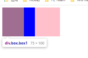
浏览器显示结果
黄色盒子(box1)为 75px
红色盒子(box2)为 37.5px
蓝色盒子(box3)为 87.5px
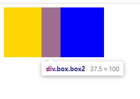
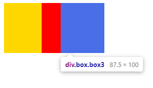
为什么?
回答
三个item的宽度之和是250px,父容器200px,相差-50px.
需要每个item缩减来分配这个差值.如何缩减则按flex-shrink计算.
家里有笔外债要还,三兄弟每人出一部分抵债
计算方式是先求所有item flex-shrink * flex-basis(width) 之和,100 * 2 + 50 * 2 + 100 * 1 = 400
再计算每个item在这个和中的占比
本例中为0.5 0.25 0.25
用这个比例分配差值(债务分配)
本例中为25px 12.5px 12.5px
以上是 flex-shrink 的一个问题 的全部内容, 来源链接: utcz.com/a/27658.html